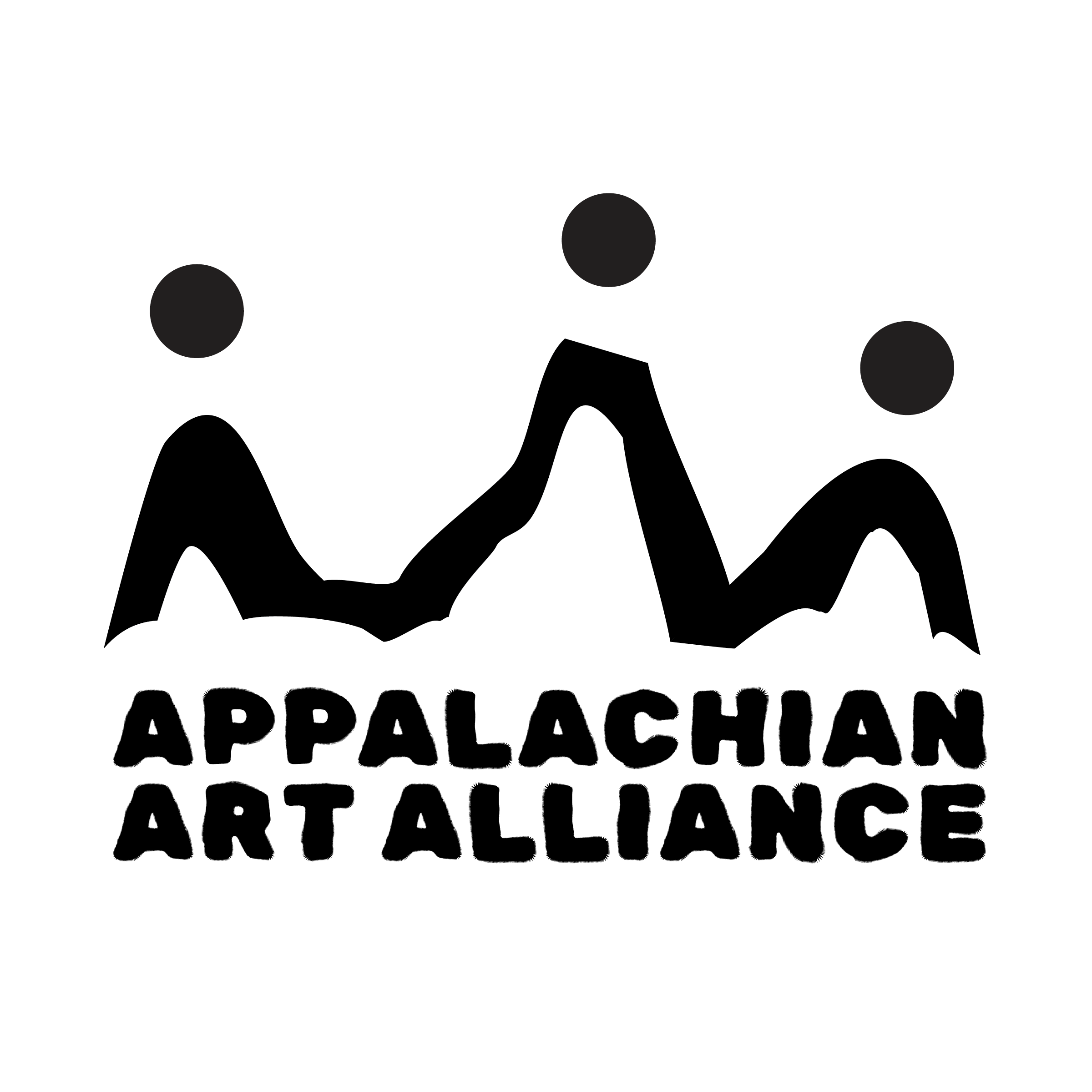

APPALACHIAN ARTS ALLIANCE
Event Identity System · 2025
The Idea
The Appalachian Arts Alliance identity supports a series of cultural events celebrating music, craft, and storytelling across the Appalachian region. The challenge was to create one parent brand with multiple event identities that feel connected, but never interchangeable.
Where It Started
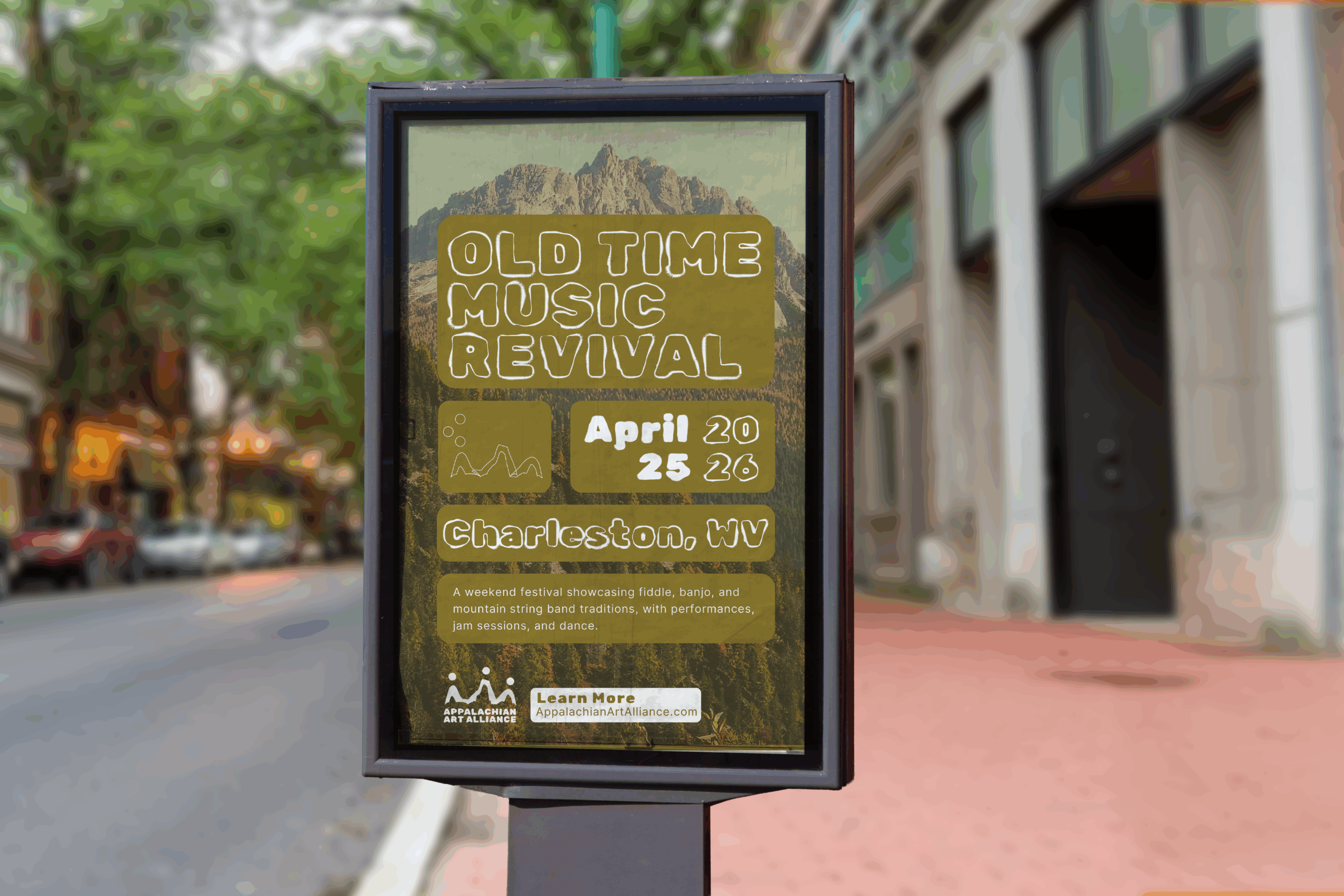
The system draws inspiration from regional visual language — quilt patterns, hand-painted signage, lantern light, and mountain silhouettes. I wanted the identity to feel warm, human, and rooted in place, without leaning into clichés.
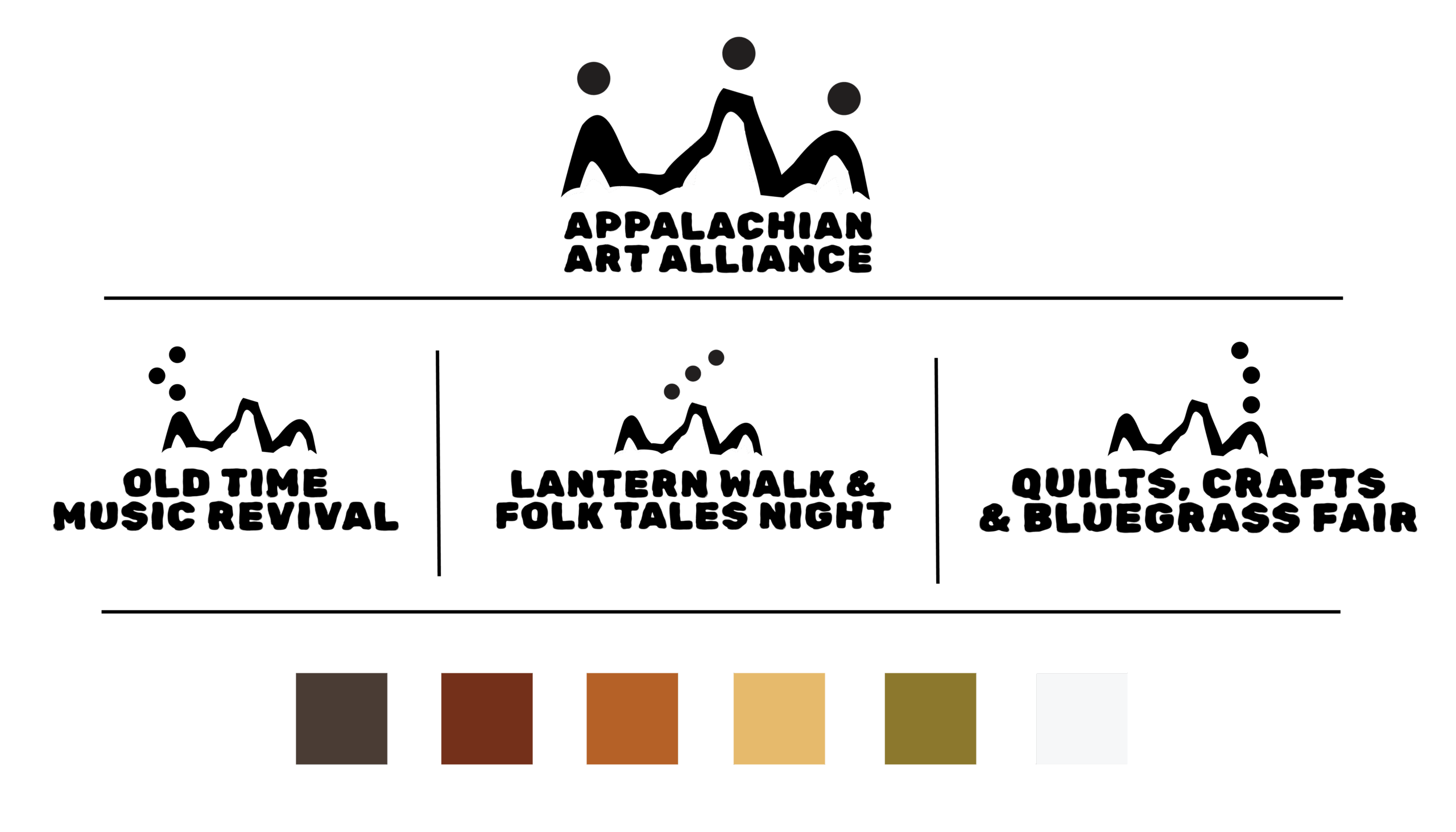
A System That Shifts
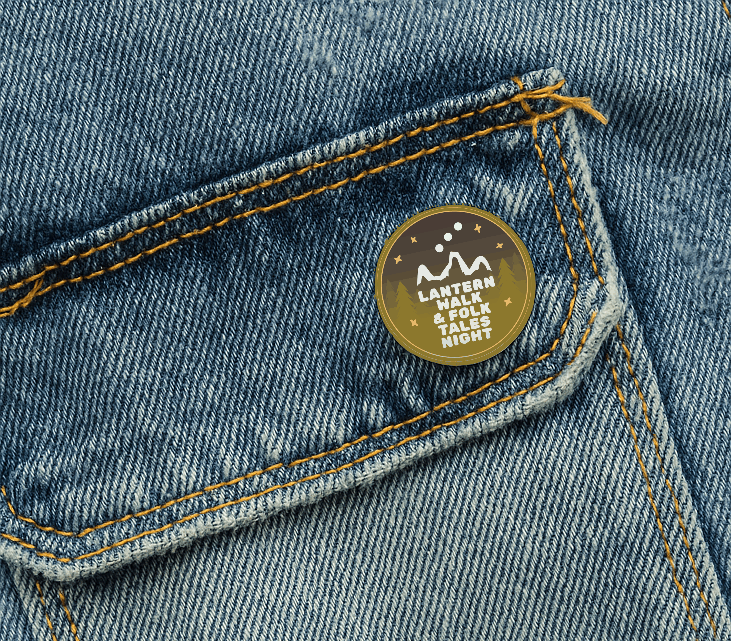
At the center is a shared logo structure that stays consistent across the Alliance, while subtle alterations — especially in the dot patterns — allow each event to develop its own visual personality. The changes are small but meaningful, creating variety without losing recognition.
The Design Details
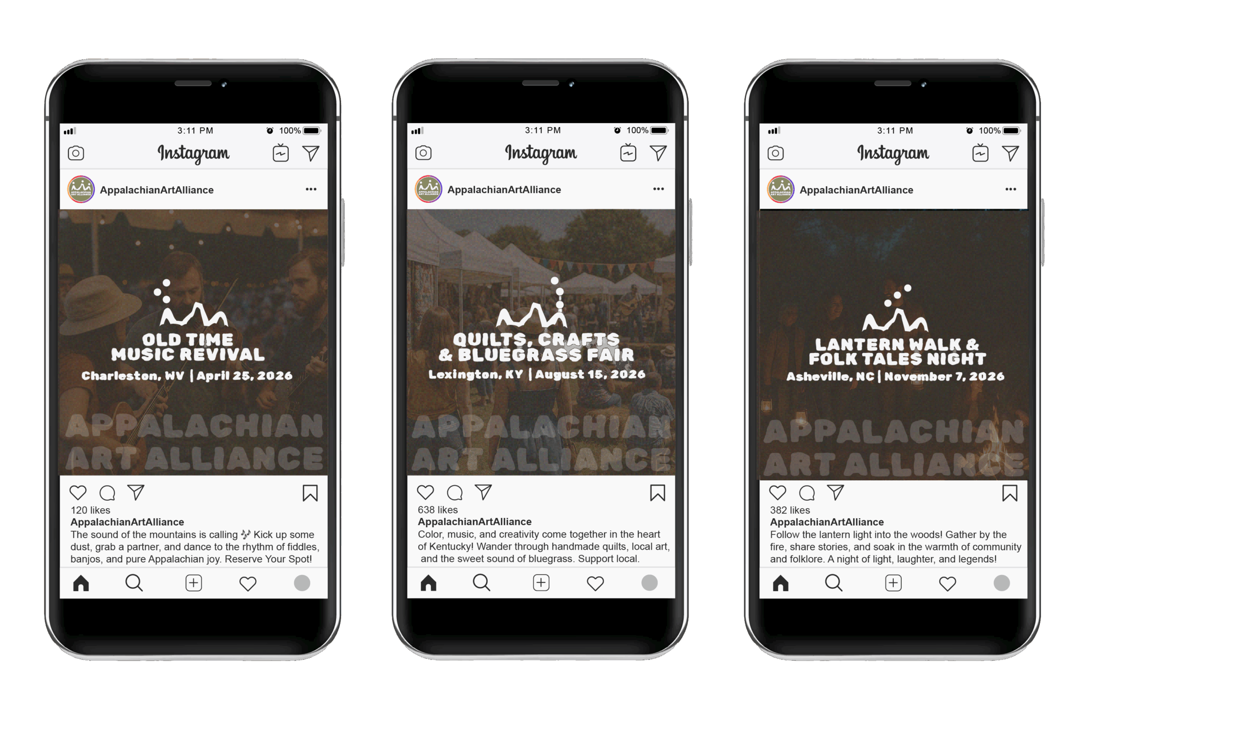
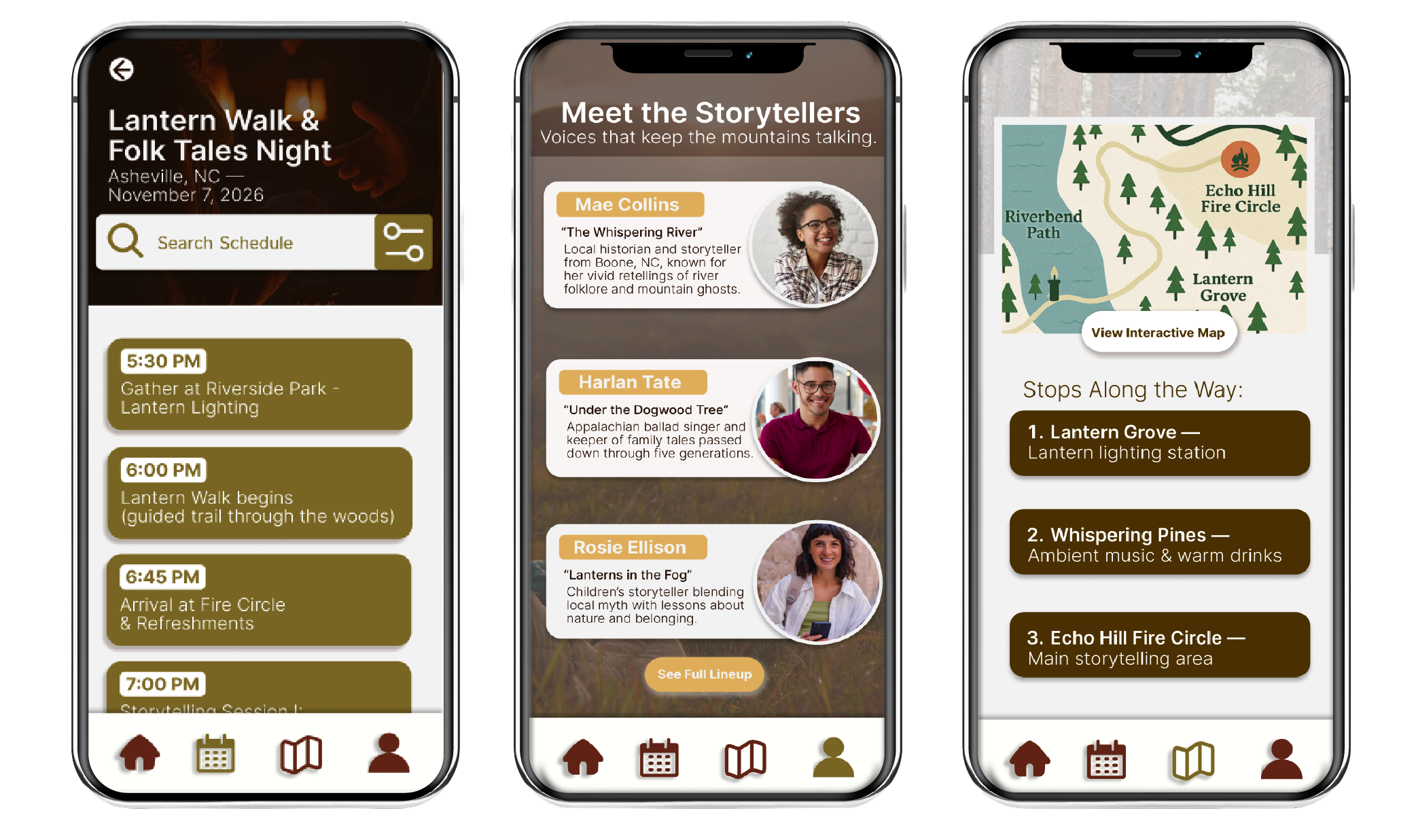
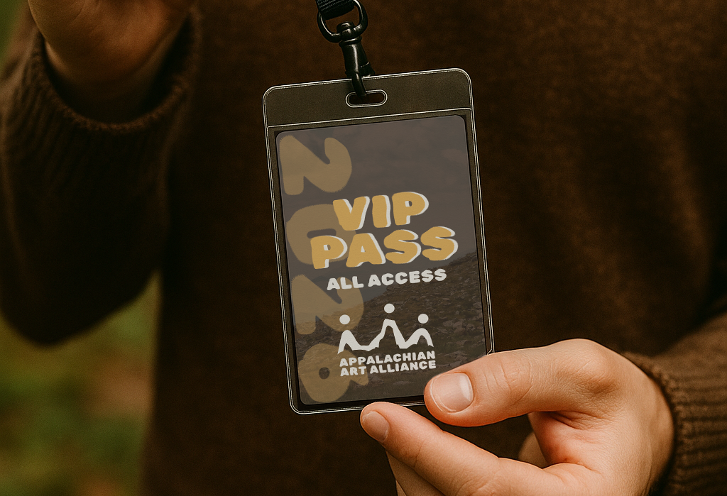
A cohesive type system and flexible layouts hold everything together, while each event gets its own color story and iconography. The system is designed to work across posters, social graphics, and simple UI moments like schedules and maps.
The Result
The final identity feels warm, grounded, and people-focused. It gives the Alliance a recognizable visual voice while leaving room for each event to feel specific, local, and rooted in its own story.
APPALACHIAN ARTS ALLIANCE
Event Identity System · 2025
The Idea
The Appalachian Arts Alliance identity supports a series of cultural events celebrating music, craft, and storytelling across the Appalachian region. The challenge was to create one parent brand with multiple event identities that feel connected, but never interchangeable.
Where It Started
The system draws inspiration from regional visual language — quilt patterns, hand-painted signage, lantern light, and mountain silhouettes. I wanted the identity to feel warm, human, and rooted in place, without leaning into clichés.
A System That Shifts
At the center is a shared logo structure that stays consistent across the Alliance, while subtle alterations — especially in the dot patterns — allow each event to develop its own visual personality. The changes are small but meaningful, creating variety without losing recognition.
The Design Details
A cohesive type system and flexible layouts hold everything together, while each event gets its own color story and iconography. The system is designed to work across posters, social graphics, and simple UI moments like schedules and maps.
The Result
The final identity feels warm, grounded, and people-focused. It gives the Alliance a recognizable visual voice while leaving room for each event to feel specific, local, and rooted in its own story.
Selected Works