
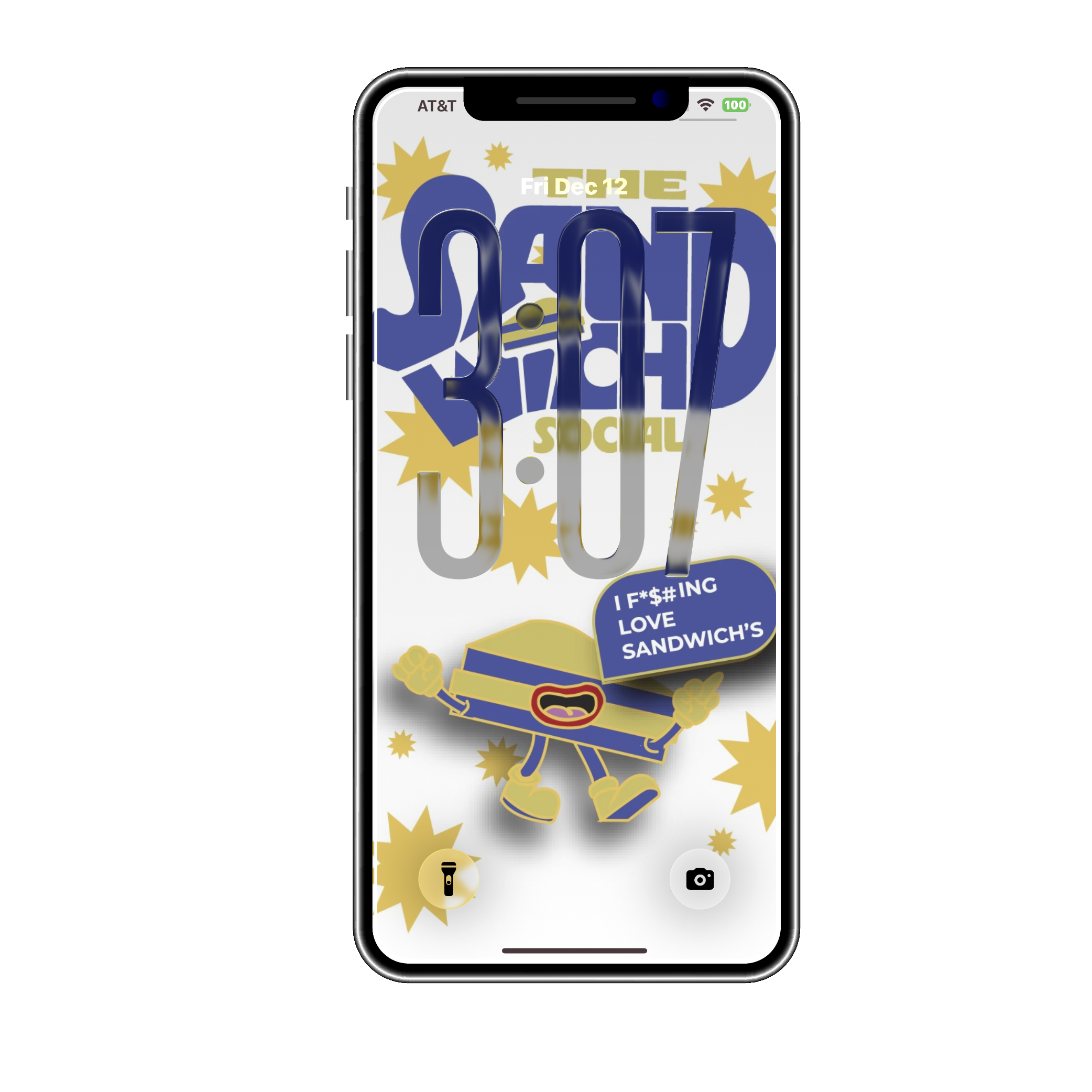
THE SANDWICH SOCIAL
Digital Festival Identity · 2025
The Idea
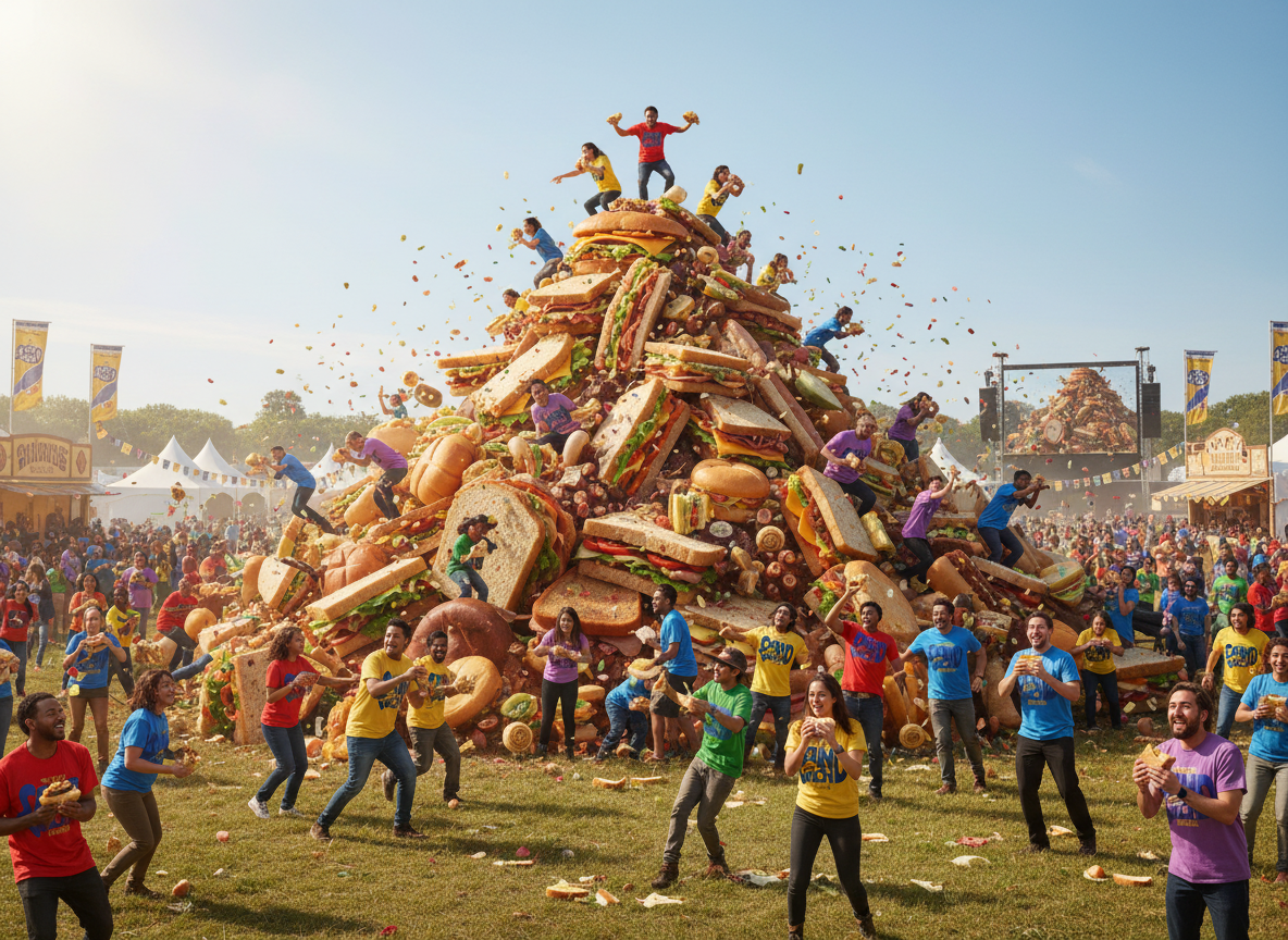
The Sandwich Social is a digital-first festival identity built around the chaotic joy of sandwich culture. The brand celebrates everything loud, messy, and lovable about food fandom, creating a playful world designed to live online and thrive in motion.
Where It Started
The idea came from treating sandwiches with the same over-the-top enthusiasm usually reserved for music or street festivals. I wanted the identity to feel unapologetically fun — like it knows it’s ridiculous and fully leans into it.
Making It Loud (in a Good Way)
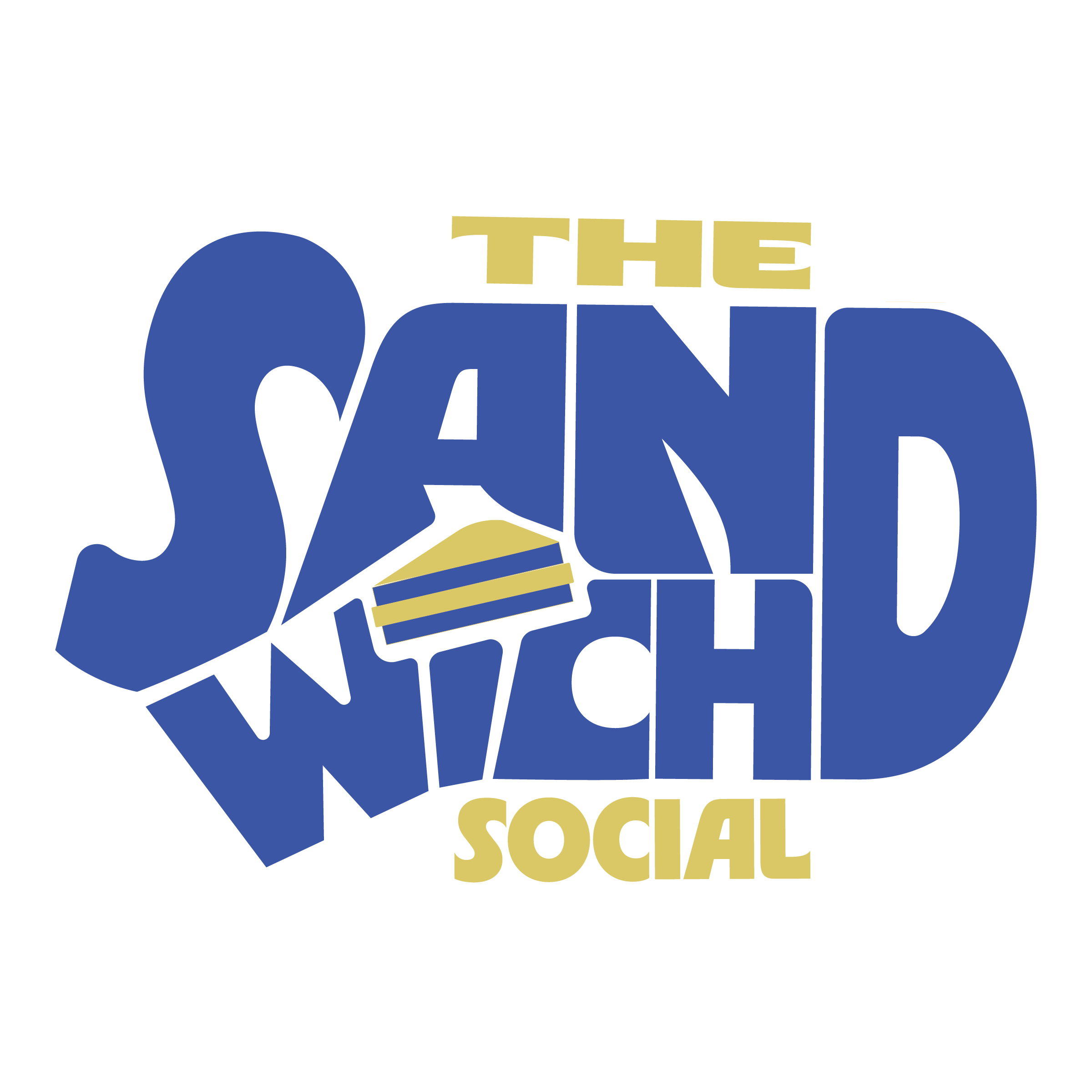
Chunky lettering, bold color blocking, and exaggerated shapes define the visual system. The logo itself sets the tone, with a sandwich cleverly replacing the “I” in Sandwich, instantly signaling that this brand doesn’t take itself too seriously.
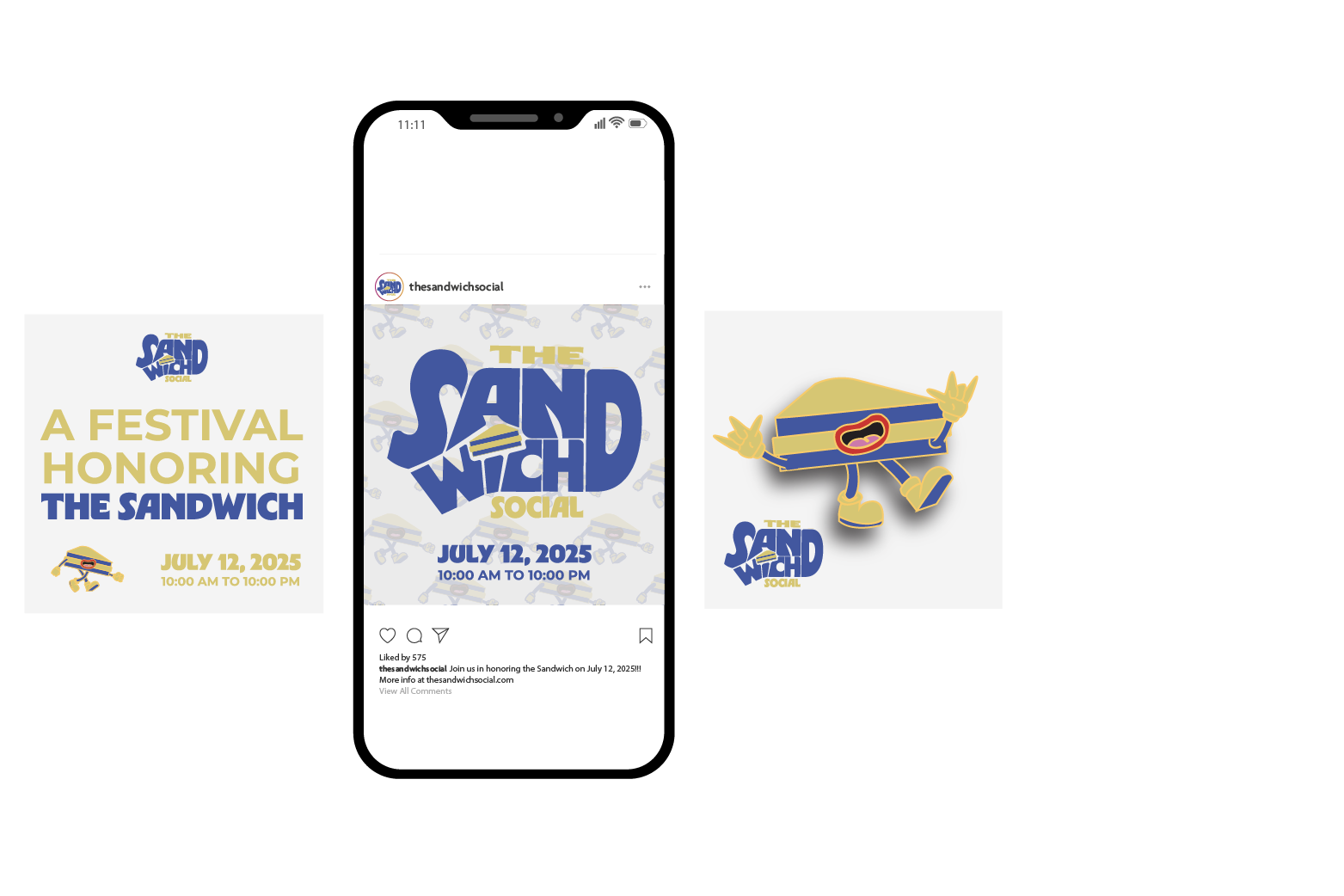
Playful characters, oversized graphics, and motion-forward layouts push the energy further, making the brand feel alive, scrollable, and constantly in motion.
The Design Details
Every visual decision supports the festival’s personality — fun, loud, and impossible to ignore. Despite the chaos, structure and hierarchy keep the system usable across screens, balancing illustration, motion, and UI design.
The Result
The final identity blends humor with clarity, creating a believable digital festival experience that feels energetic without becoming overwhelming. It shows how playful concepts can still be executed with intention, structure, and strong visual systems.
THE SANDWICH SOCIAL
Digital Festival Identity · 2025
The Idea
The Sandwich Social is a digital-first festival identity built around the chaotic joy of sandwich culture. The brand celebrates everything loud, messy, and lovable about food fandom, creating a playful world designed to live online and thrive in motion.
Where It Started
The idea came from treating sandwiches with the same over-the-top enthusiasm usually reserved for music or street festivals. I wanted the identity to feel unapologetically fun — like it knows it’s ridiculous and fully leans into it.
Making It Loud (in a Good Way)
Chunky lettering, bold color blocking, and exaggerated shapes define the visual system. The logo itself sets the tone, with a sandwich cleverly replacing the “I” in Sandwich, instantly signaling that this brand doesn’t take itself too seriously.
Playful characters, oversized graphics, and motion-forward layouts push the energy further, making the brand feel alive, scrollable, and constantly in motion.
The Design Details
Every visual decision supports the festival’s personality — fun, loud, and impossible to ignore. Despite the chaos, structure and hierarchy keep the system usable across screens, balancing illustration, motion, and UI design.
The Result
The final identity blends humor with clarity, creating a believable digital festival experience that feels energetic without becoming overwhelming. It shows how playful concepts can still be executed with intention, structure, and strong visual systems.
Selected Works