
United Scoops Ice Cream Co
Brand Identity and Packaging - 2025
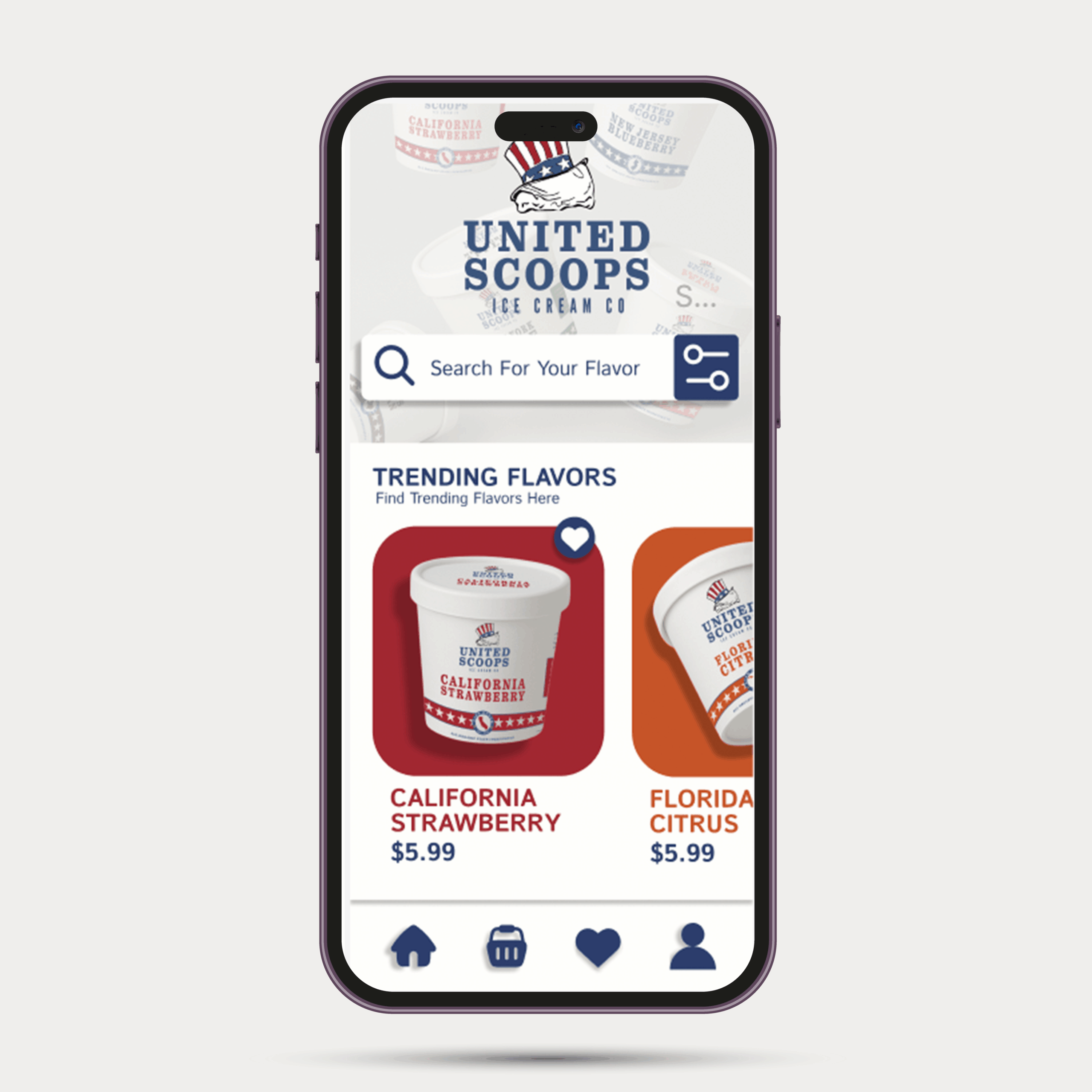
The Idea
United Scoops imagines an ice cream brand where every flavor represents a different U.S. state — something playful, nostalgic, and collectible, like a summer road trip in pint form.
Where It Started
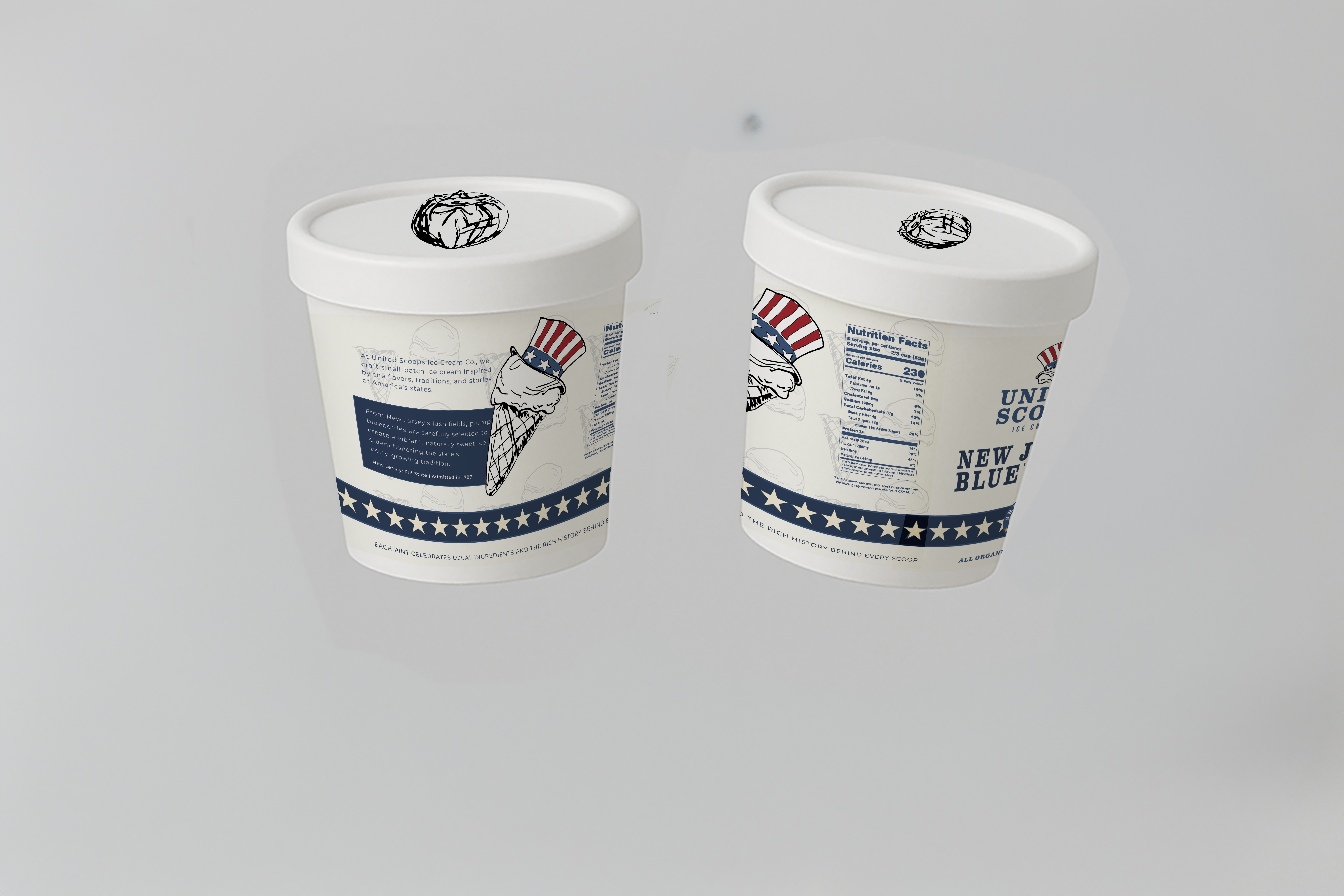
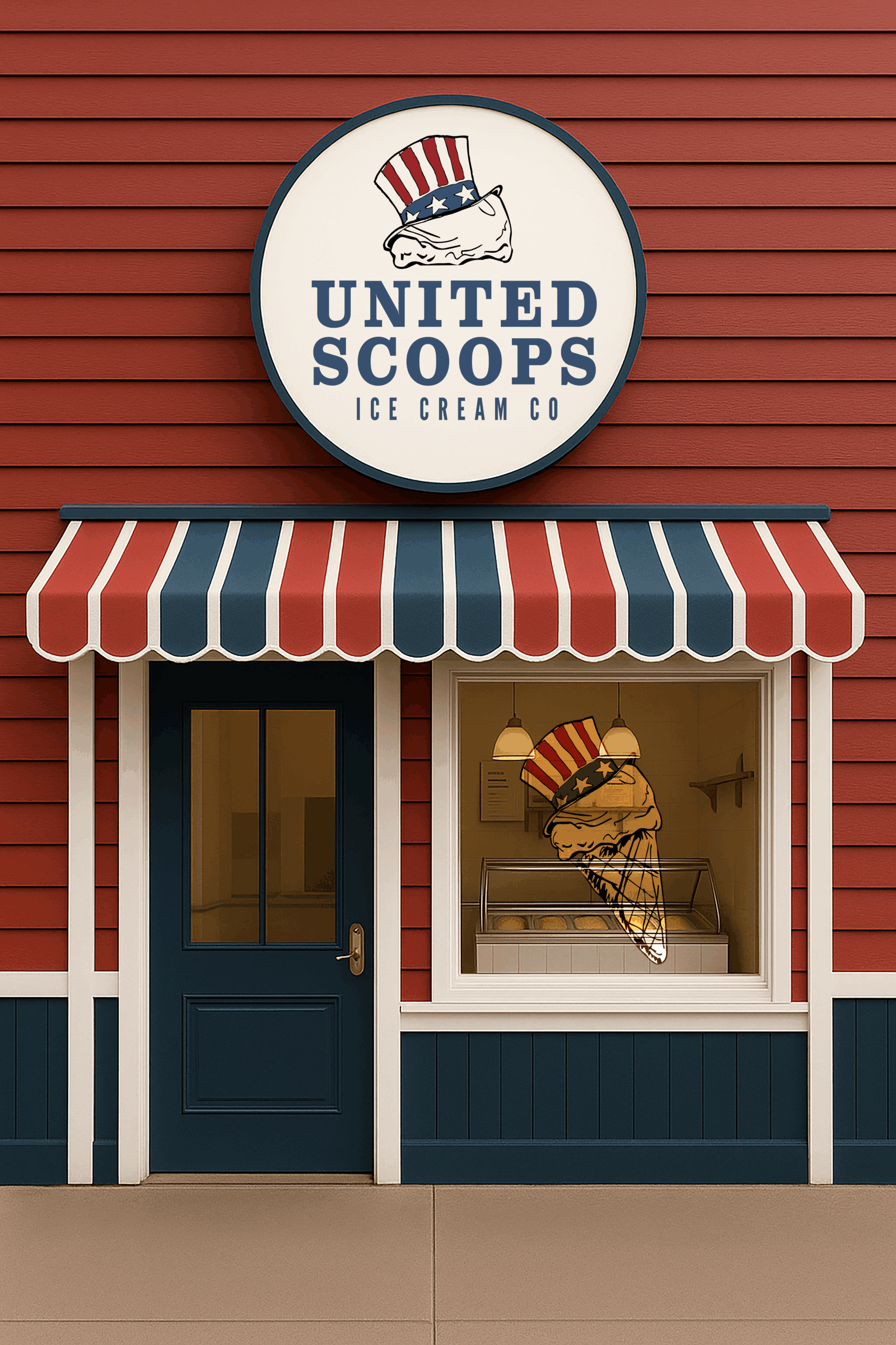
The concept began by combining classic American imagery — especially Uncle Sam — with the simple joy of an ice cream scoop and cone. I leaned into a vintage take on Americana, using bright colors that feel slightly muted and worn rather than loud or overly modern.
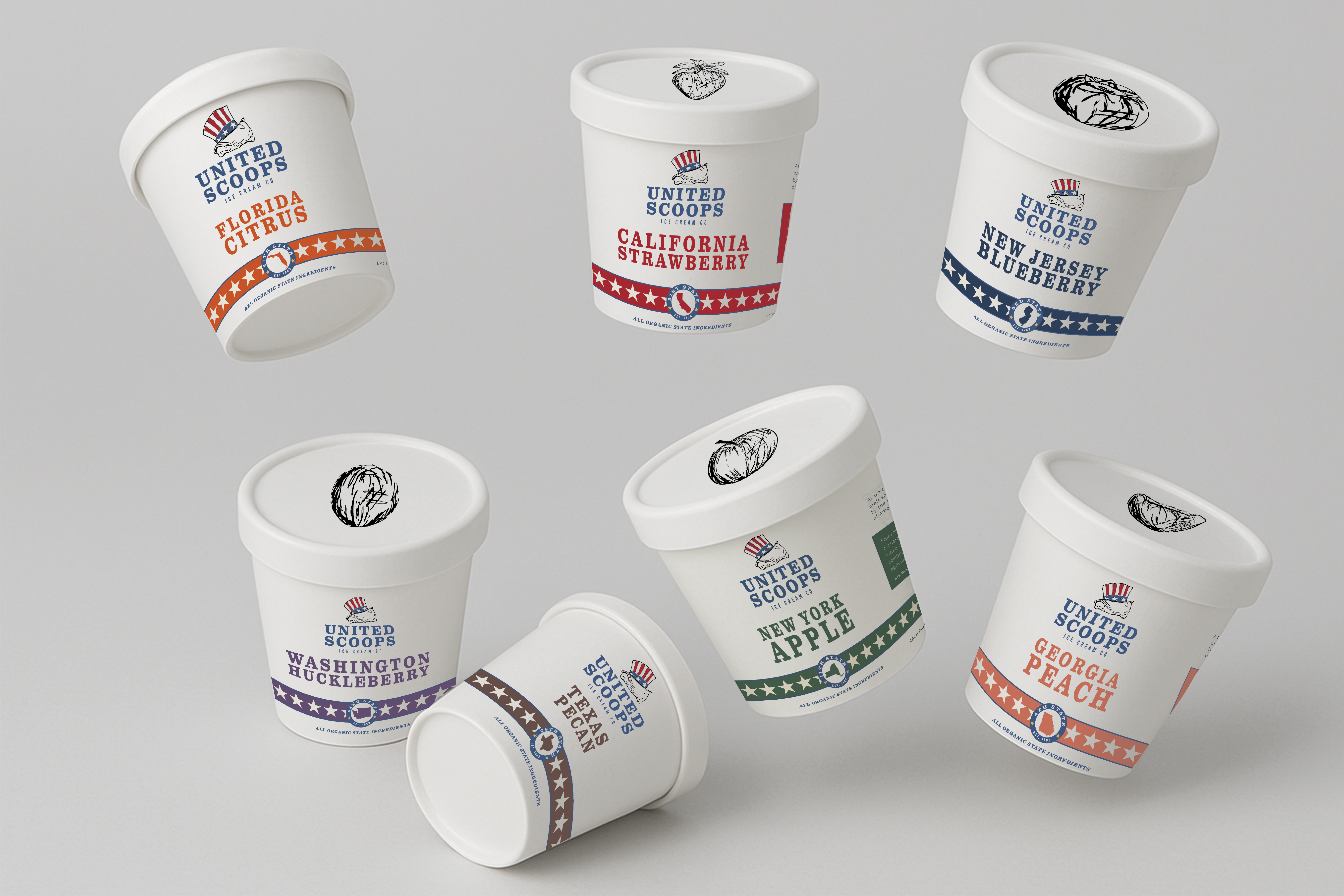
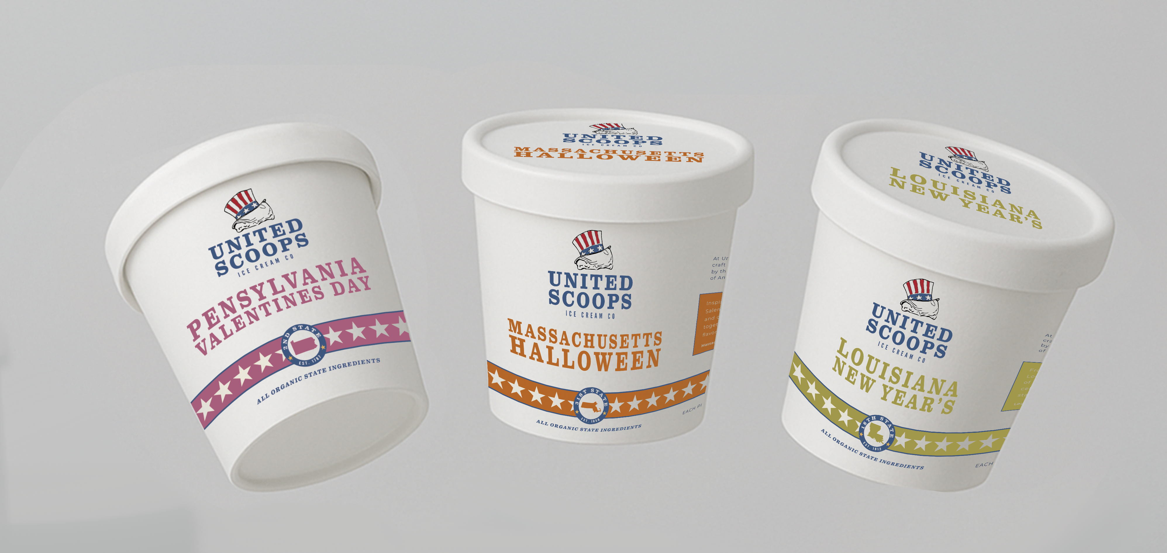
Making Each State Its Own Thing
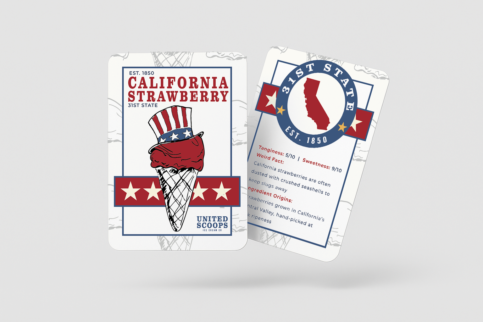
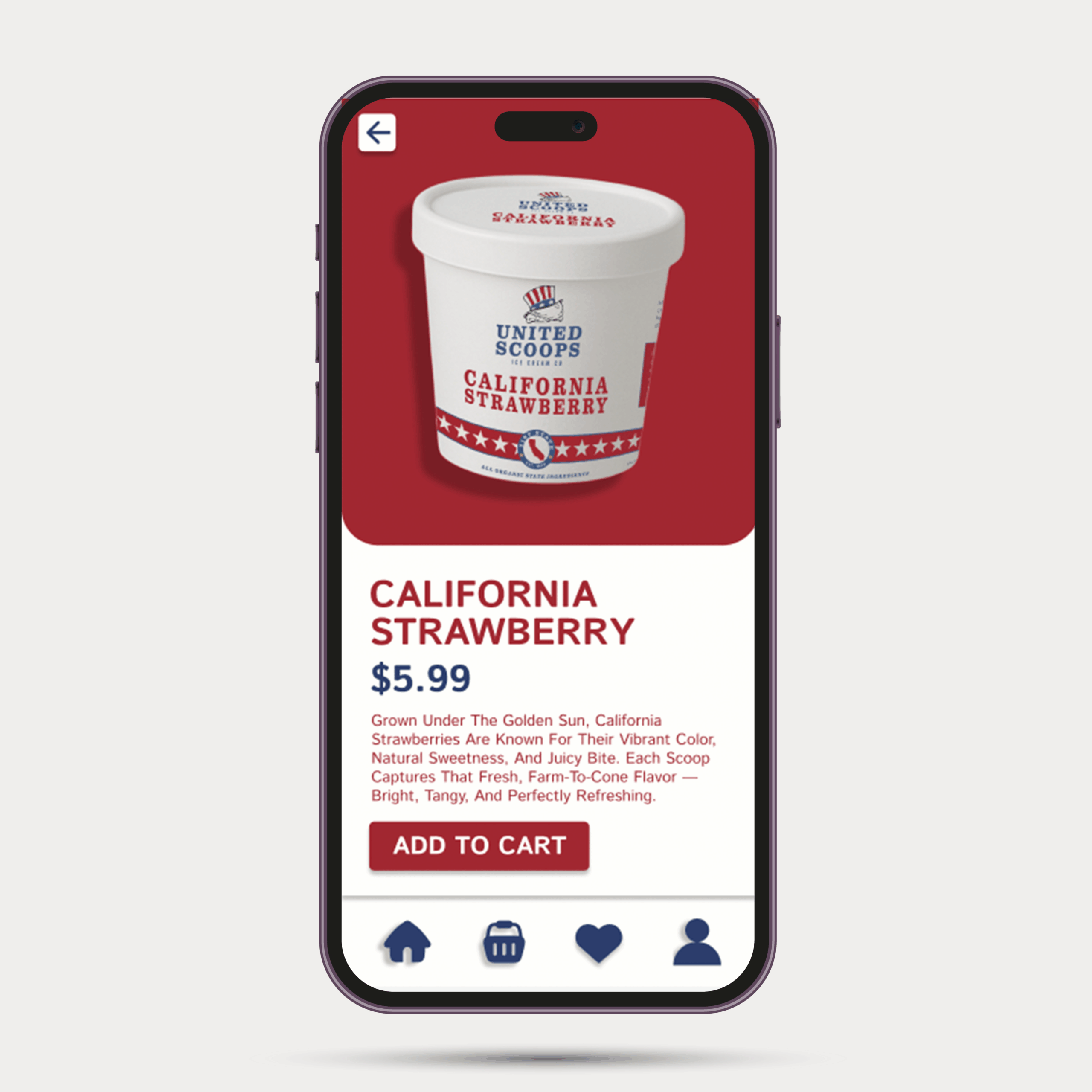
Each pint is designed to feel like a tiny collectible. Along with the flavor and illustrations, every label includes the state name, the year it was established, its order of statehood, and a set of fun facts that bring the place to life. These details turn each pint into more than just packaging — they become little snapshots of each state.
The Design Details
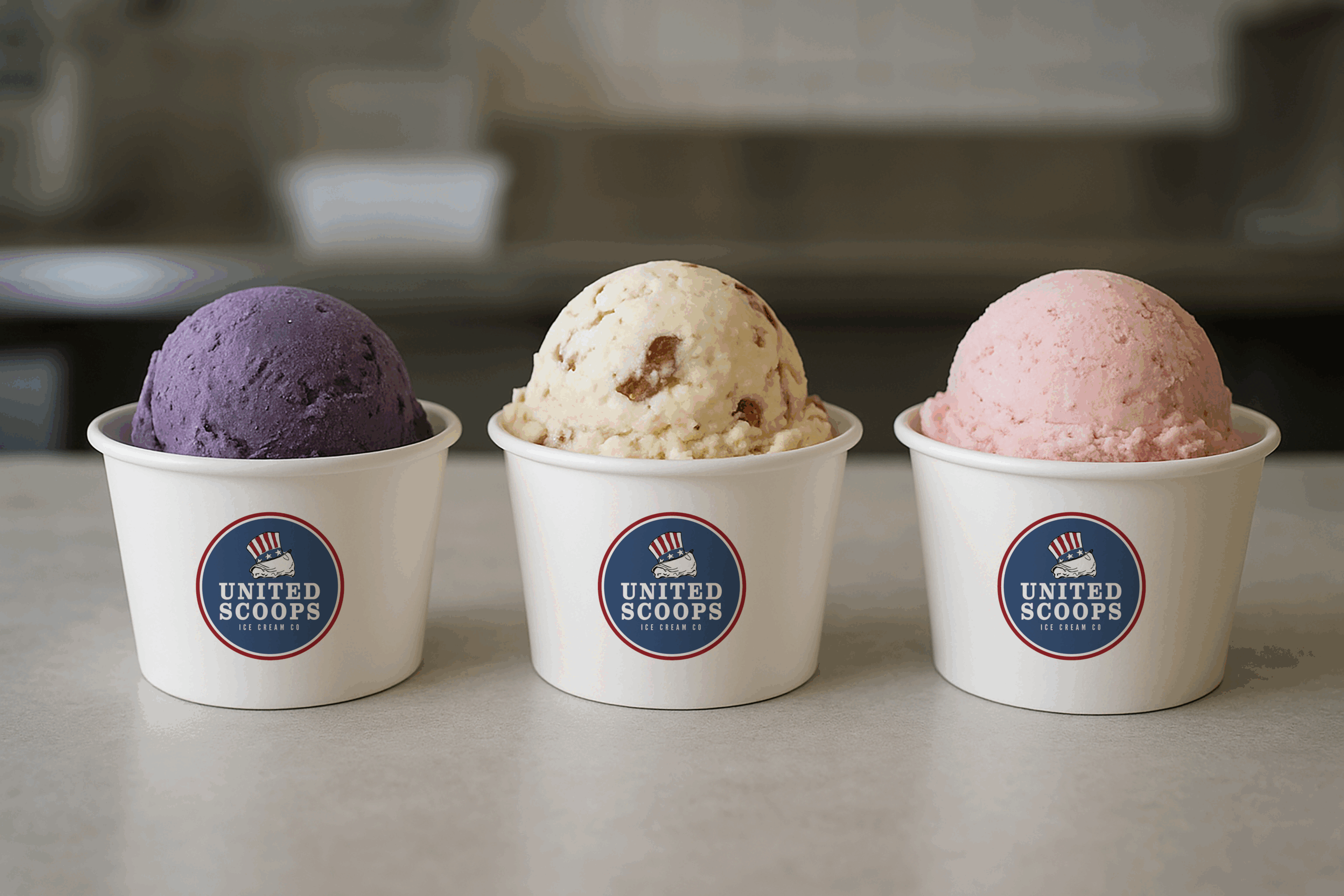
Each lid features a sketched fruit illustration to give every flavor its own personality and reinforce a handcrafted, vintage feel. A consistent band and label system keeps everything clearly United Scoops, while shifts in color, icons, and naming allow each state to stand out. Built to Collect
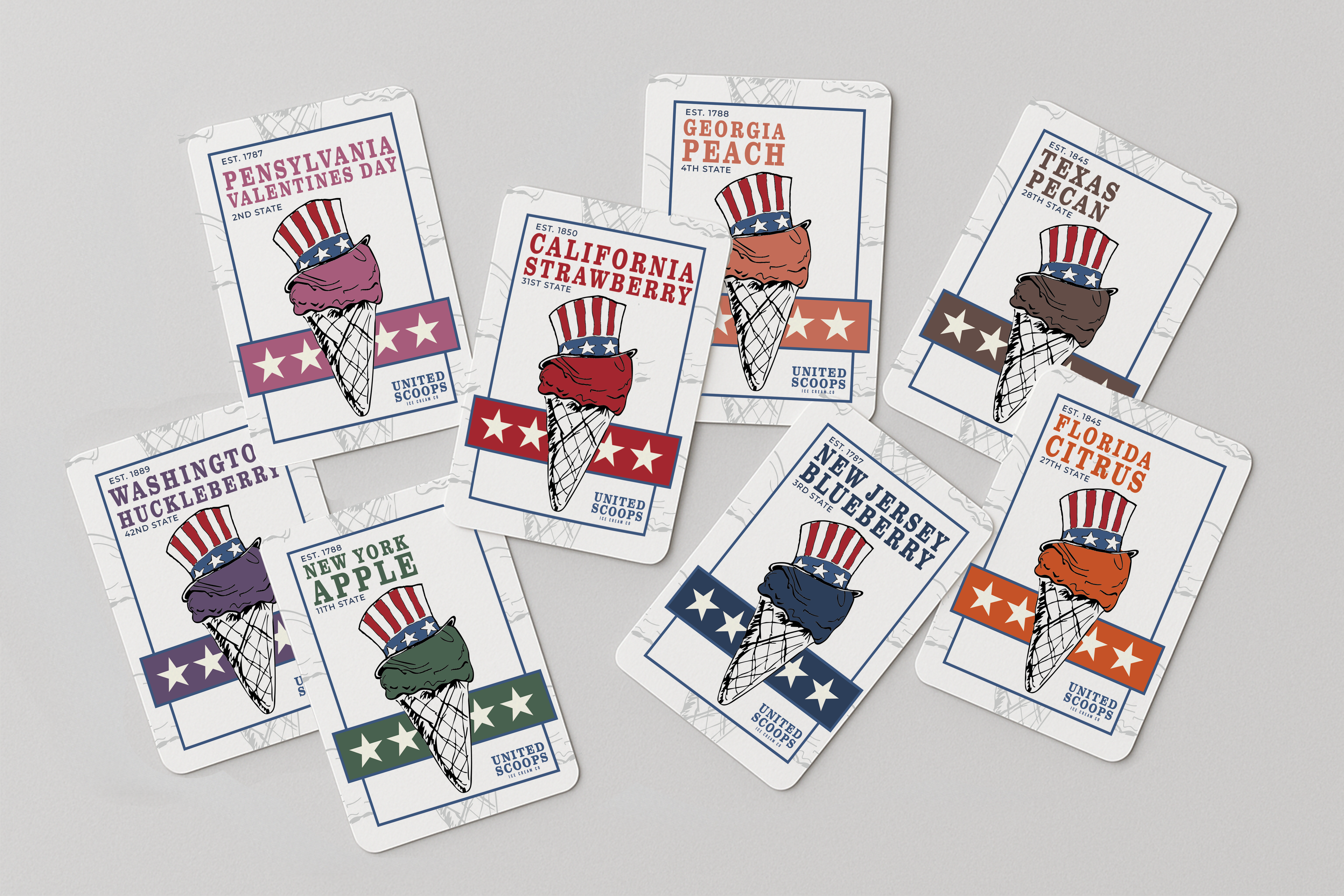
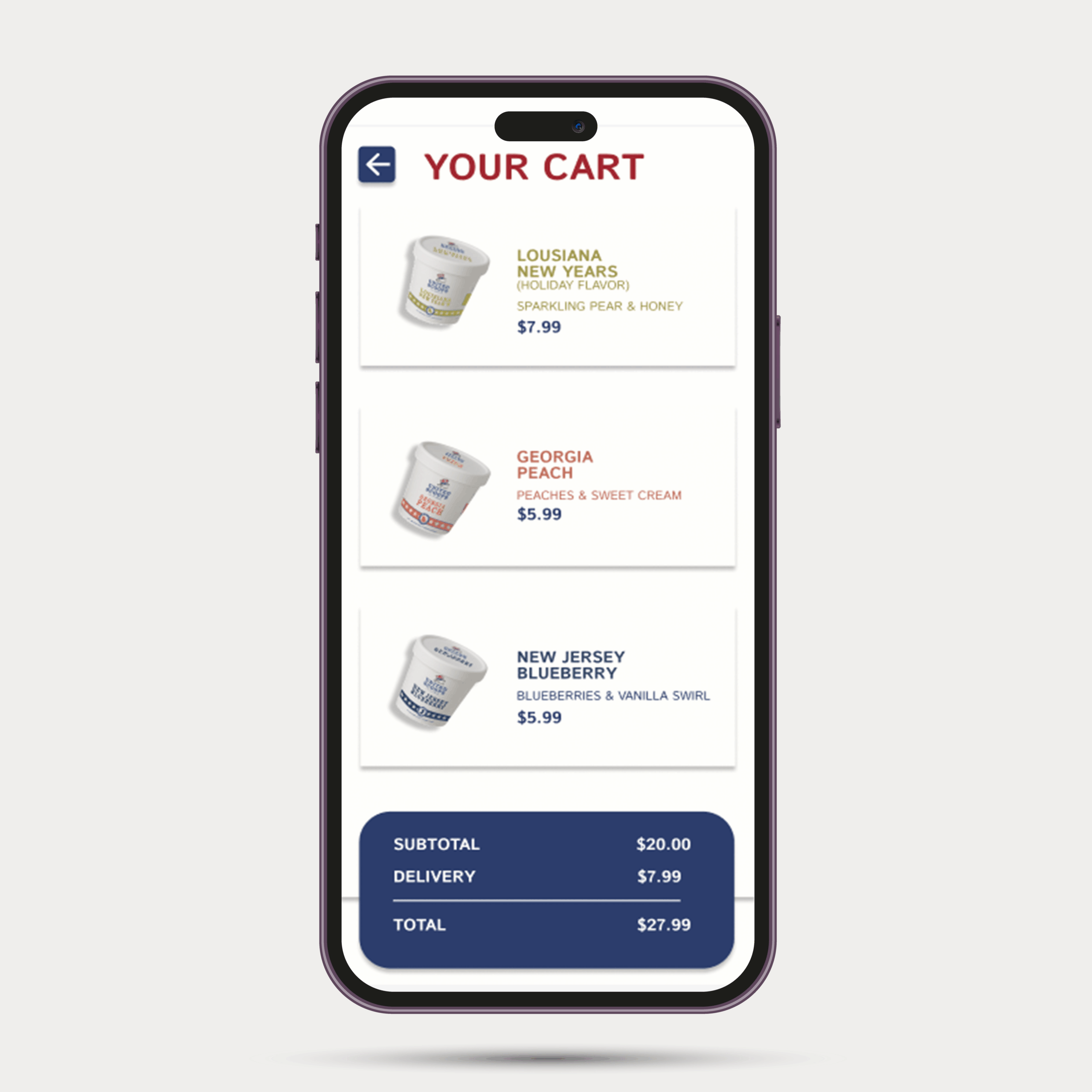
To push the collectible idea even further, every pint comes with a matching trading card that mirrors the same information found on the packaging. Together, the pints and cards encourage people to collect, compare, and learn about different states.
The Result
The final system feels nostalgic, fun, and scalable. It supports dozens of flavors without losing clarity and invites people to collect states the way they might collect postcards, souvenirs, or travel memories.
United Scoops Ice Cream Co
Brand Identity and Packaging - 2025
The Idea
United Scoops imagines an ice cream brand where every flavor represents a different U.S. state — something playful, nostalgic, and collectible, like a summer road trip in pint form.
Where It Started
The concept began by combining classic American imagery — especially Uncle Sam — with the simple joy of an ice cream scoop and cone. I leaned into a vintage take on Americana, using bright colors that feel slightly muted and worn rather than loud or overly modern.
Making Each State Its Own Thing
Each pint is designed to feel like a tiny collectible. Along with the flavor and illustrations, every label includes the state name, the year it was established, its order of statehood, and a set of fun facts that bring the place to life. These details turn each pint into more than just packaging — they become little snapshots of each state.
The Design Details
Each lid features a sketched fruit illustration to give every flavor its own personality and reinforce a handcrafted, vintage feel. A consistent band and label system keeps everything clearly United Scoops, while shifts in color, icons, and naming allow each state to stand out. Built to Collect
To push the collectible idea even further, every pint comes with a matching trading card that mirrors the same information found on the packaging. Together, the pints and cards encourage people to collect, compare, and learn about different states.
The Result
The final system feels nostalgic, fun, and scalable. It supports dozens of flavors without losing clarity and invites people to collect states the way they might collect postcards, souvenirs, or travel memories.
Selected Works