
CELLAR 78
Experimental Identity & Packaging - 2025
The Idea
Cellar 78 brings a fictional myth to life: a one-night-only speakeasy hidden beneath Split Rock Lighthouse in 1978, serving a mysterious wine called Sailors’ Delight. The goal was to treat this invented story as if it were real — designing the artifacts that might have been left behind after a night that never officially existed.
Where It Started
The concept is rooted in maritime folklore and late-night rumors — the kind of story you hear once and aren’t sure is true. I wanted the brand to feel like a secret passed between sailors, locals, and lighthouse keepers, blending history, myth, and unease into a single narrative.
Making the Story Visible
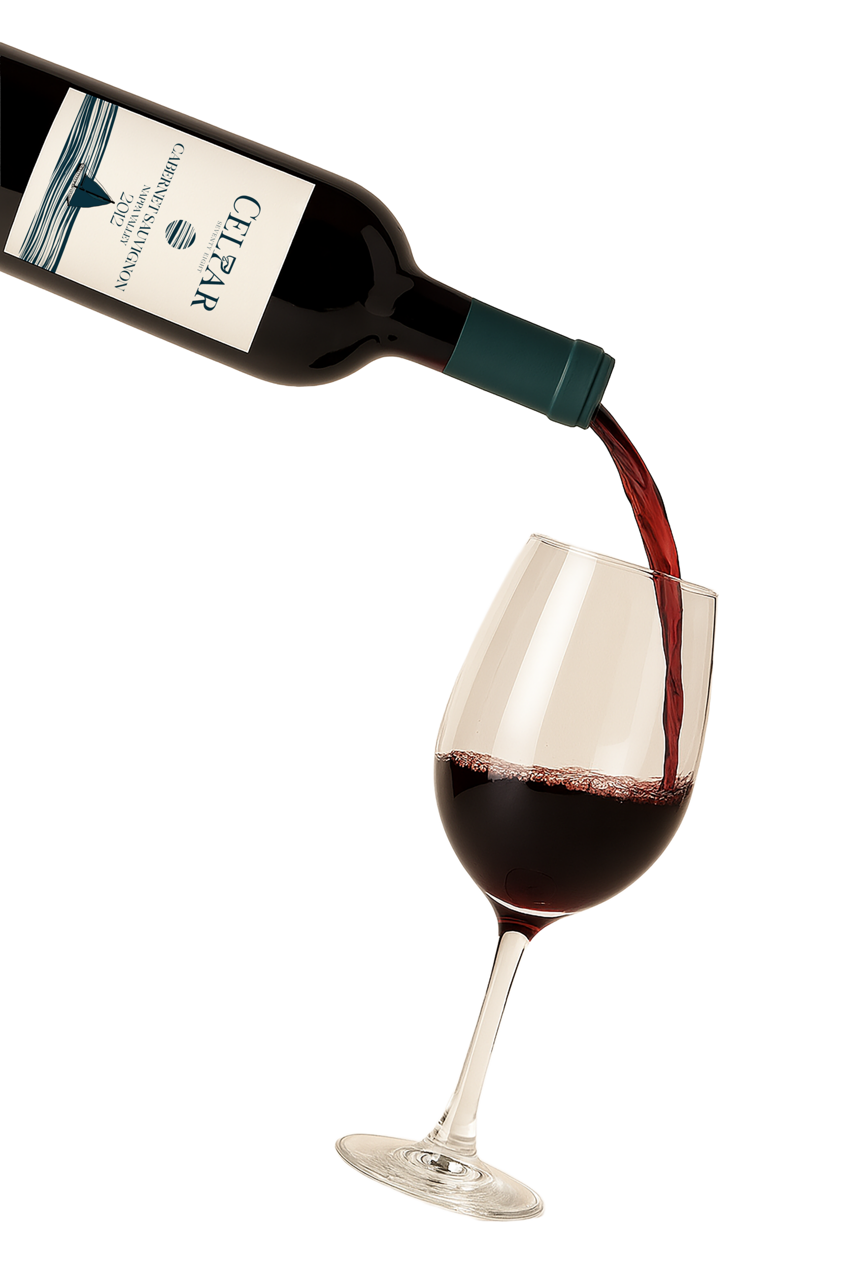
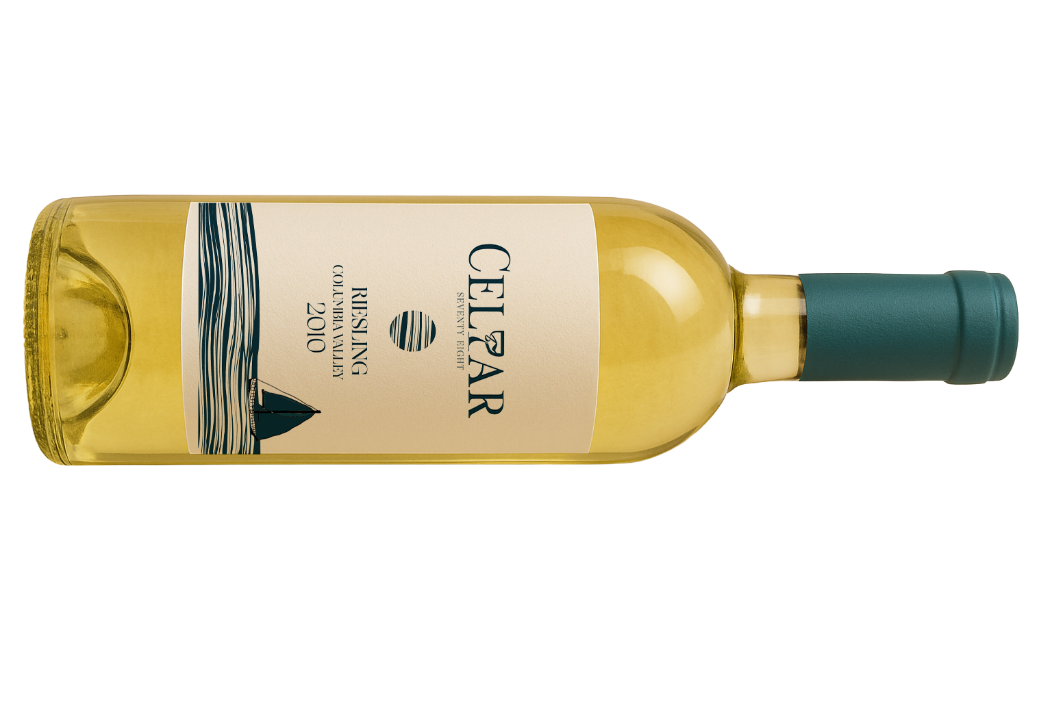
The visual language is built around tension: elegant typography and restrained layouts paired with dark, nautical colors, subtle symbols, and unsettling details. The label system is meant to feel like contraband — something you’d find in a dusty box in an attic and immediately have questions about.
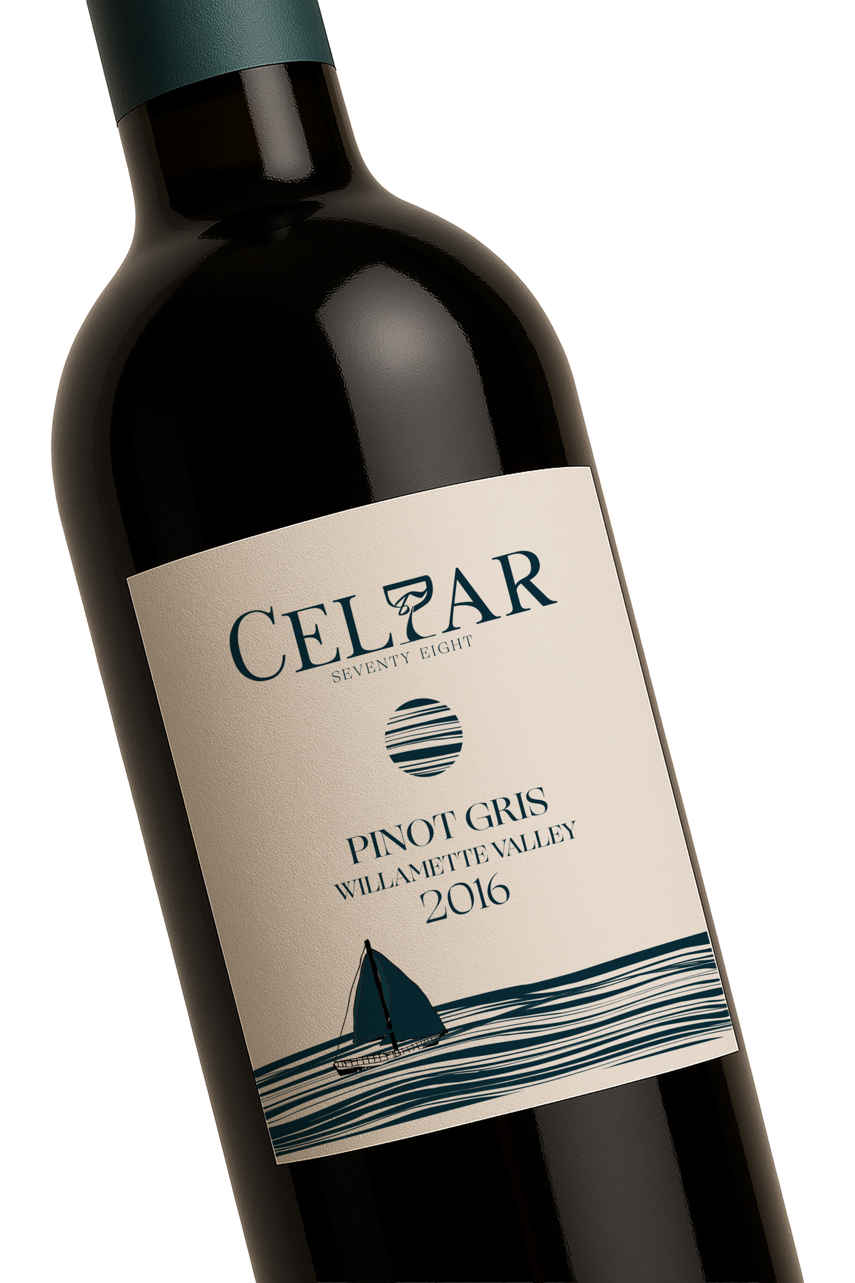
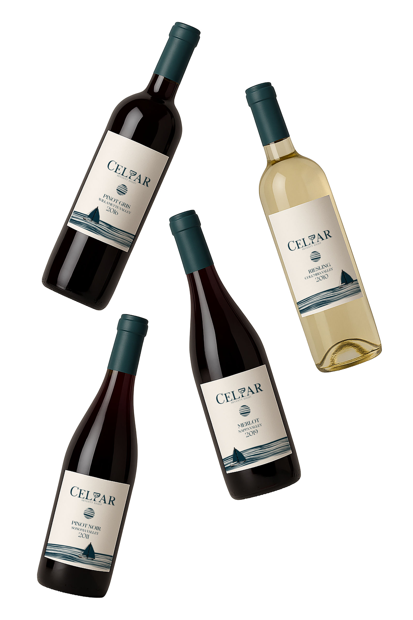
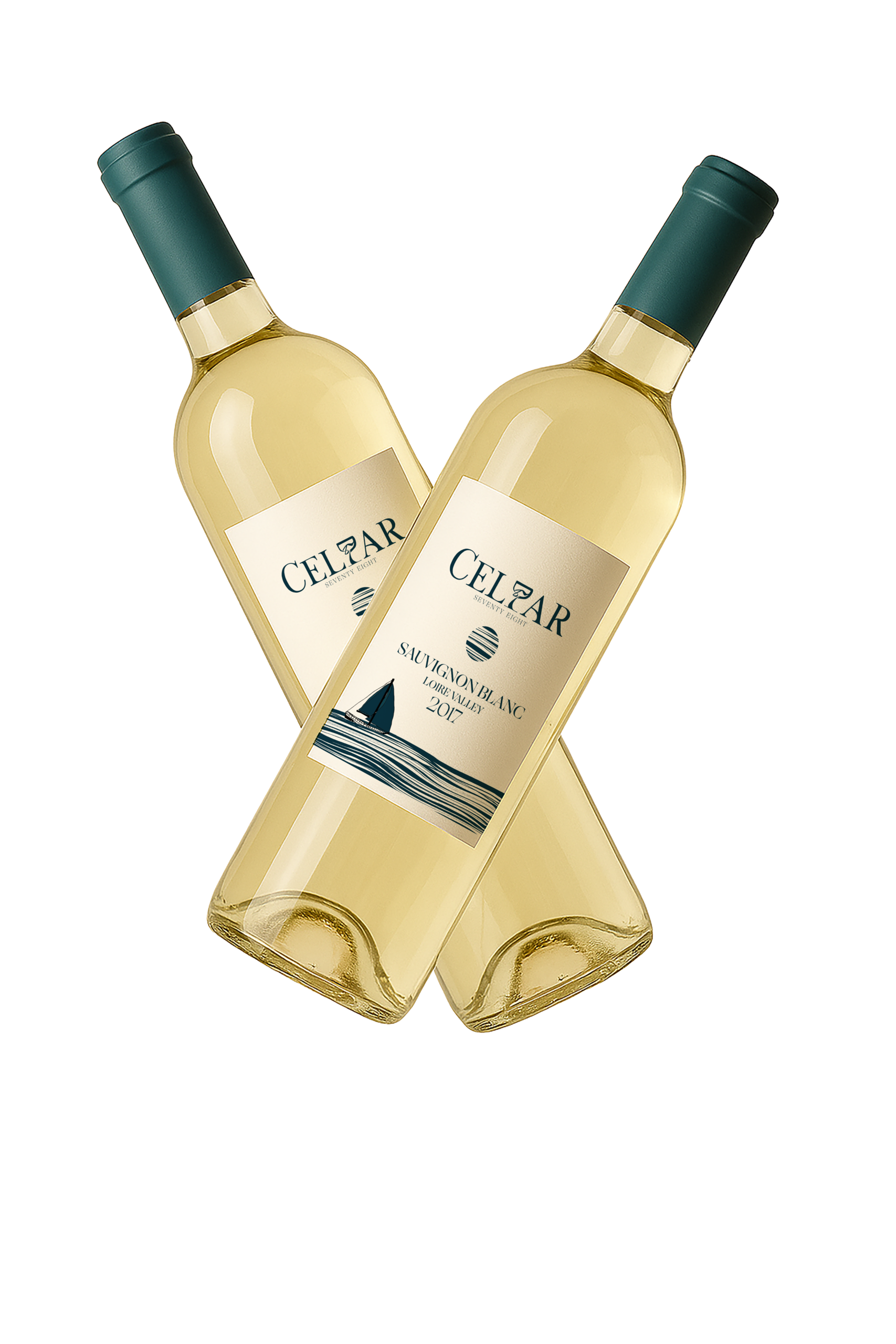
The logo itself plays into the story, with the 7 integrated into a wine glass and the L and 8 subtly incorporated into the form, making the mark feel hidden rather than obvious. Across different wine labels, a small illustrated ship appears in varying positions on the water, referencing different vessels tied to the myth and reinforcing the idea that every bottle carries a slightly different chapter of the story.
The Design Details
Every choice was made to keep the narrative feeling believable and oddly specific — from restrained color palettes to quiet, symbolic moments that reward closer inspection. Nothing is loud, but everything feels intentional.
The Result
The final work feels like evidence from a night that never happened. It demonstrates how narrative and worldbuilding can drive identity design, and how a brand can be built entirely around a feeling: mysterious, haunting, and just a little dangerous.
CELLAR 78
Experimental Identity & Packaging - 2025
The Idea
Cellar 78 brings a fictional myth to life: a one-night-only speakeasy hidden beneath Split Rock Lighthouse in 1978, serving a mysterious wine called Sailors’ Delight. The goal was to treat this invented story as if it were real — designing the artifacts that might have been left behind after a night that never officially existed.
Where It Started
The concept is rooted in maritime folklore and late-night rumors — the kind of story you hear once and aren’t sure is true. I wanted the brand to feel like a secret passed between sailors, locals, and lighthouse keepers, blending history, myth, and unease into a single narrative.
Making the Story Visible
The visual language is built around tension: elegant typography and restrained layouts paired with dark, nautical colors, subtle symbols, and unsettling details. The label system is meant to feel like contraband — something you’d find in a dusty box in an attic and immediately have questions about.
The logo itself plays into the story, with the 7 integrated into a wine glass and the L and 8 subtly incorporated into the form, making the mark feel hidden rather than obvious. Across different wine labels, a small illustrated ship appears in varying positions on the water, referencing different vessels tied to the myth and reinforcing the idea that every bottle carries a slightly different chapter of the story.
The Design Details
Every choice was made to keep the narrative feeling believable and oddly specific — from restrained color palettes to quiet, symbolic moments that reward closer inspection. Nothing is loud, but everything feels intentional.
The Result
The final work feels like evidence from a night that never happened. It demonstrates how narrative and worldbuilding can drive identity design, and how a brand can be built entirely around a feeling: mysterious, haunting, and just a little dangerous.
Selected Works