NECTARE JUICERY
Brand Identity · 2025
The Idea
Nectare is a juicery identity built strategy-first, visuals second. The goal was to create a brand that feels fresh, bright, and approachable without falling into generic “healthy lifestyle” territory.
Where It Started
I began with research and positioning — defining who Nectare is for, how it should feel, and where it sits among competitors. From there, the identity was built to feel confident and welcoming rather than minimal to the point of being bland.
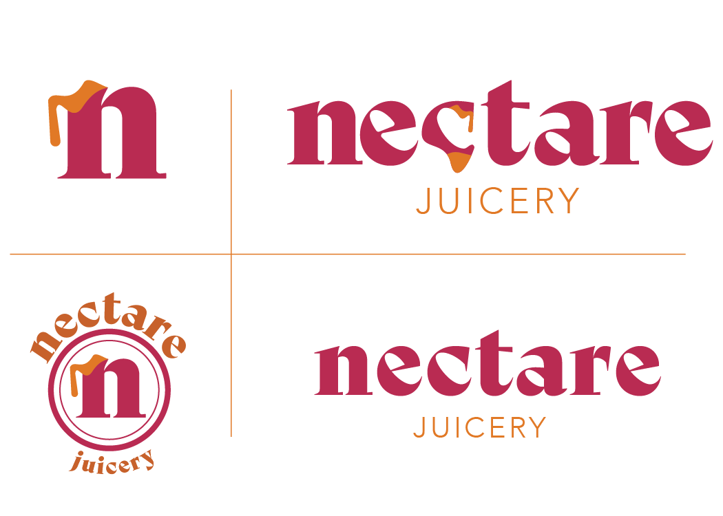
Making It Stand Out
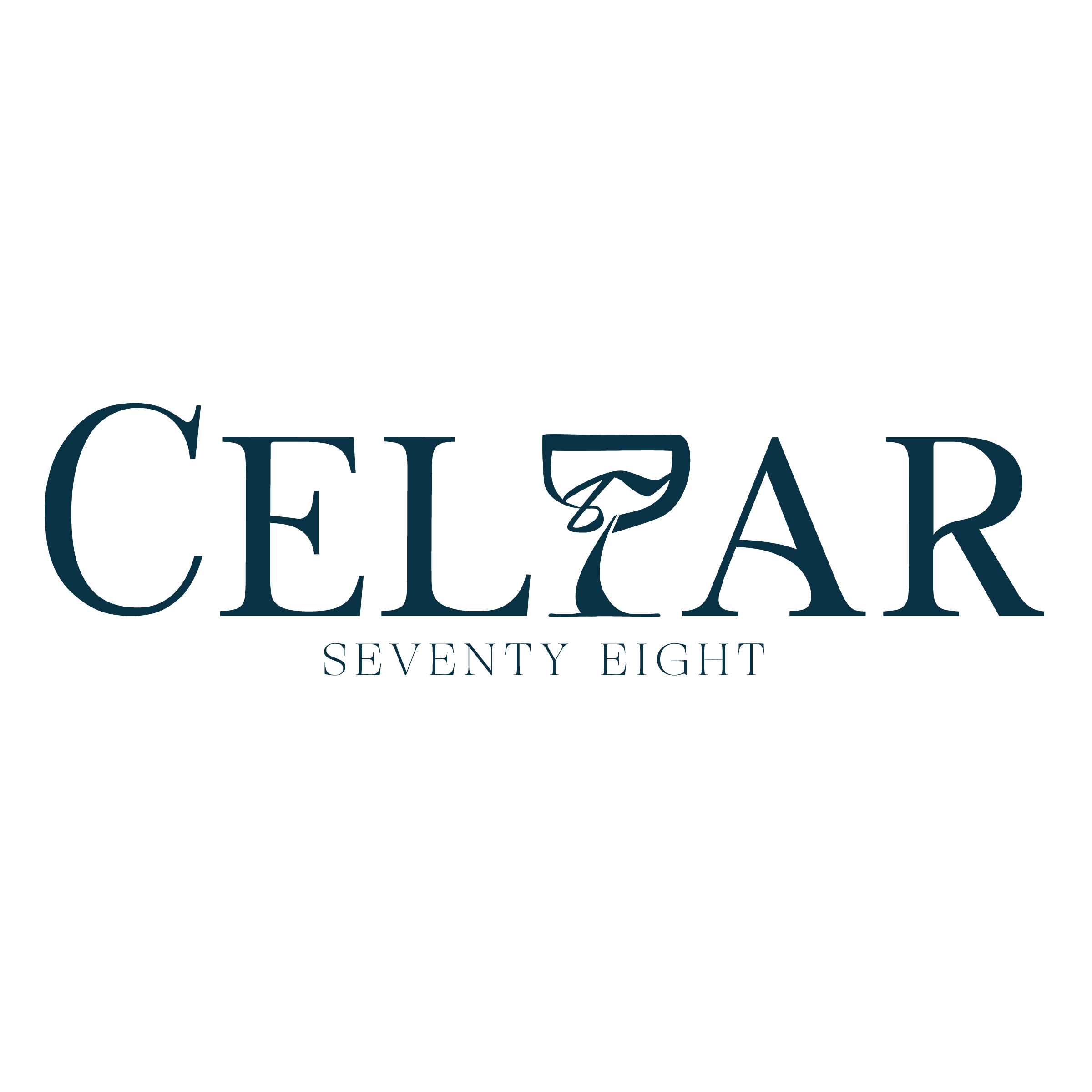
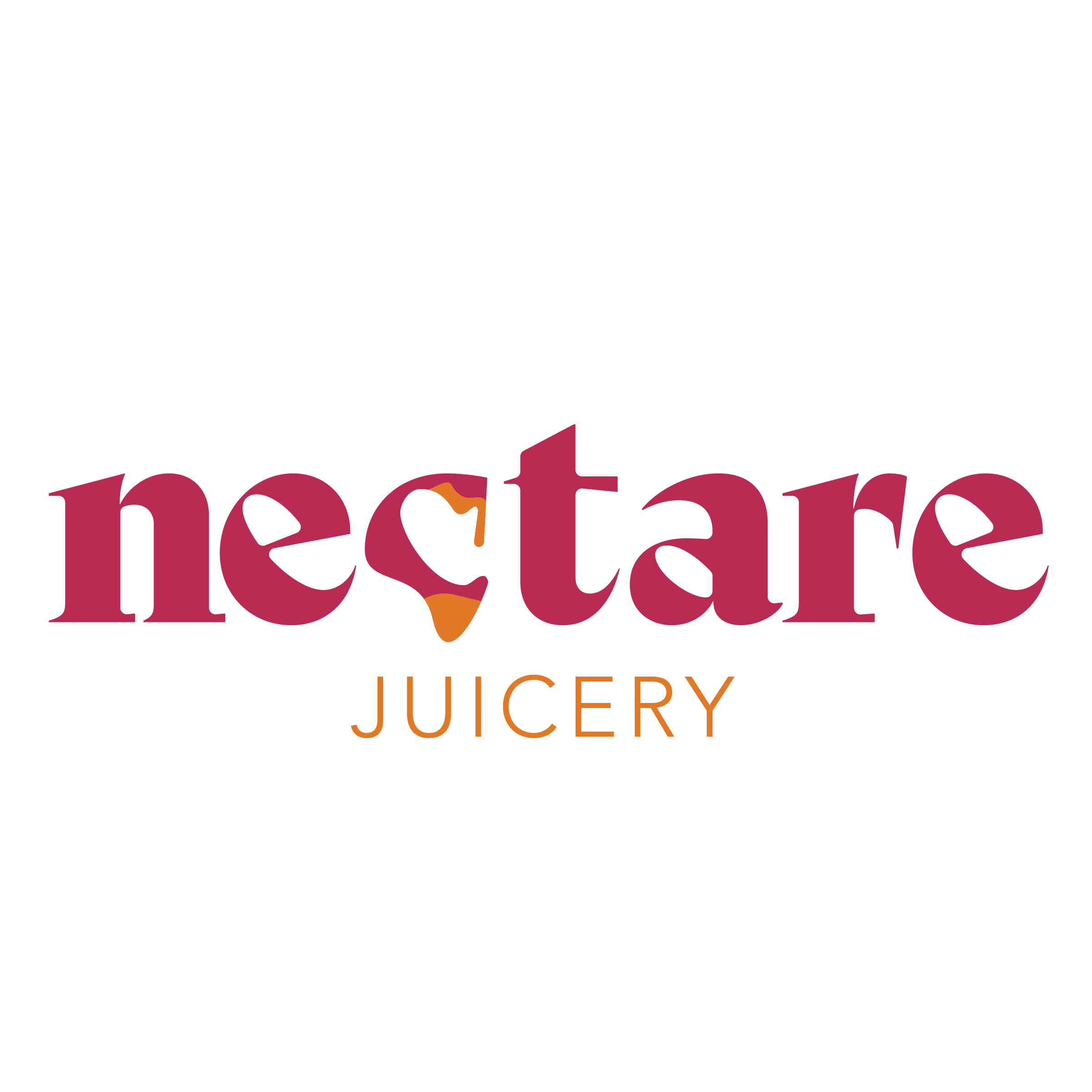
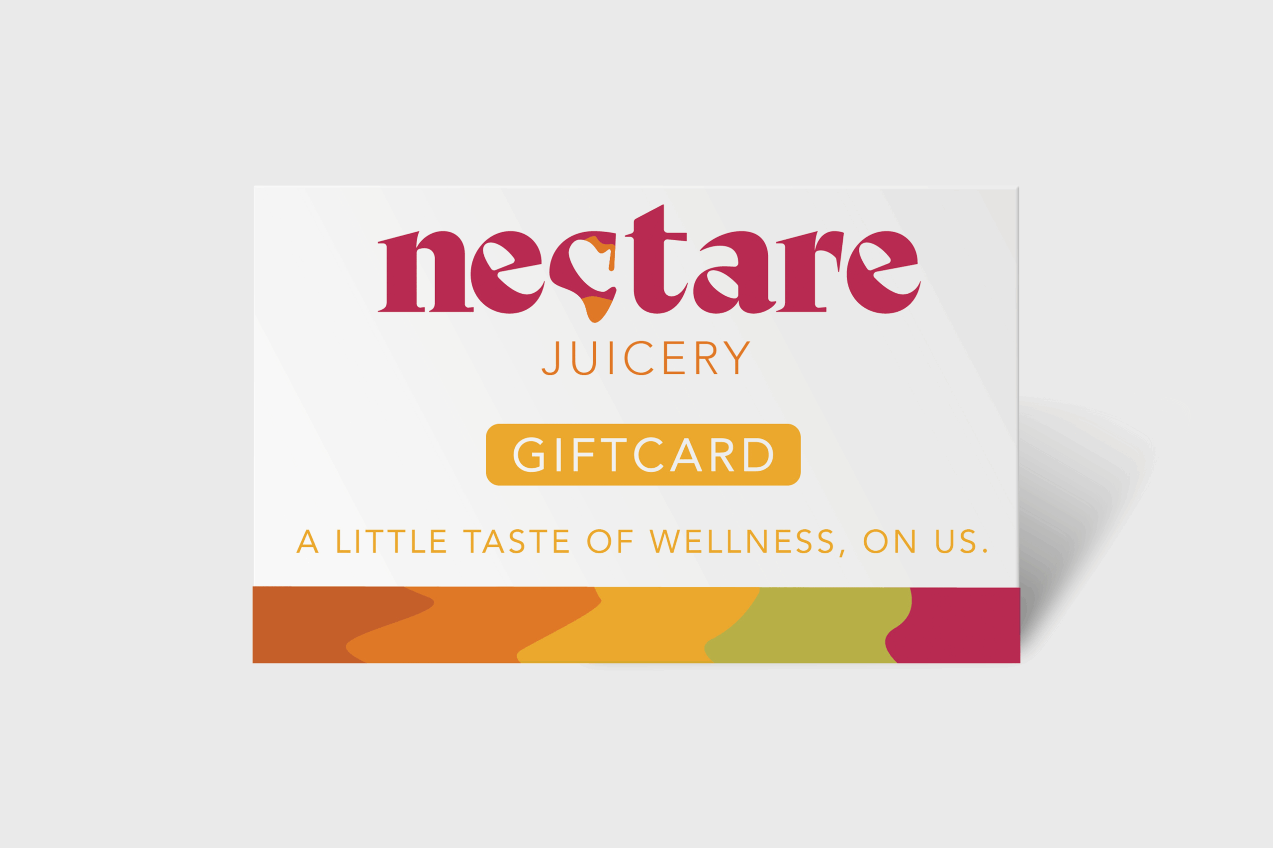
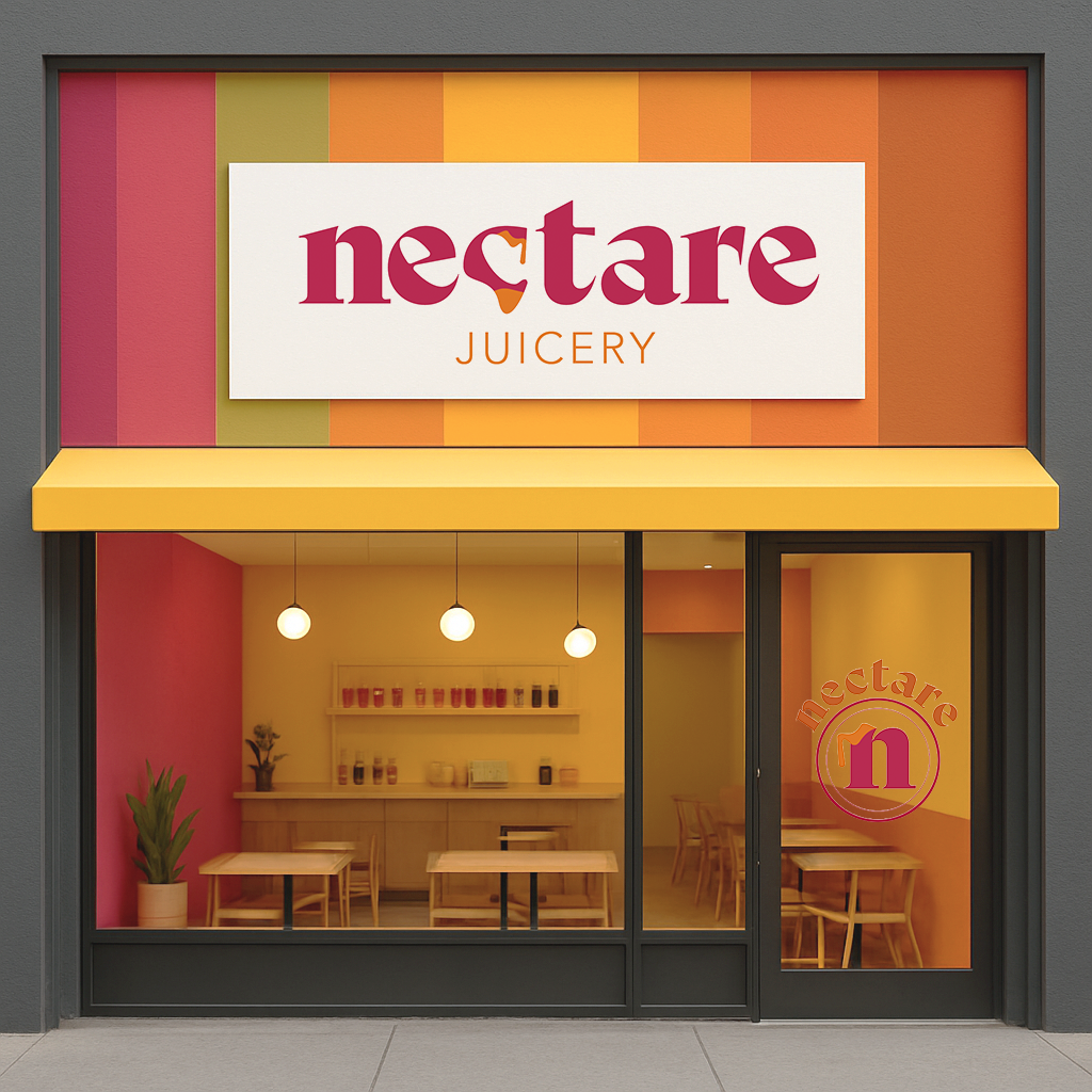
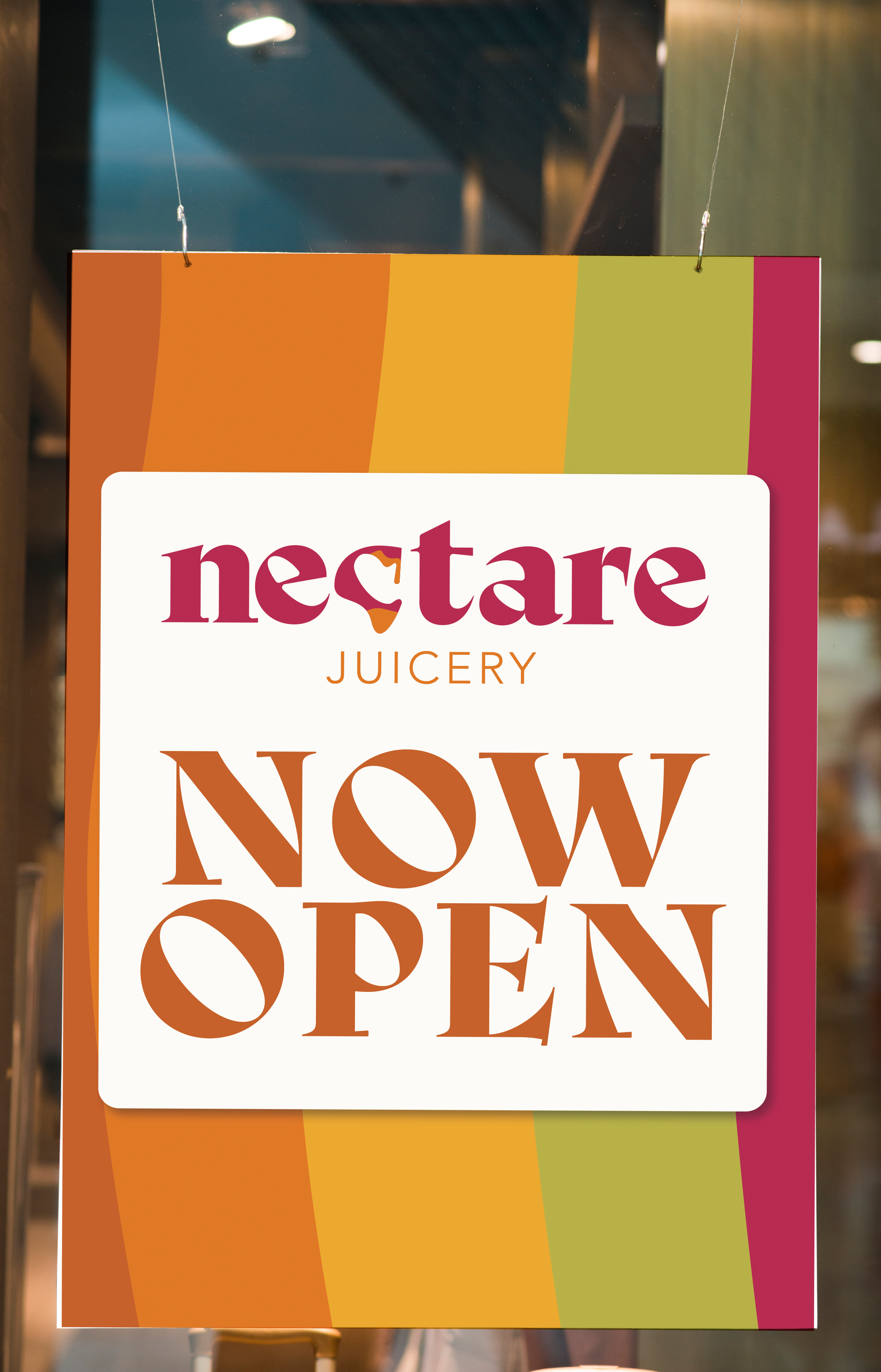
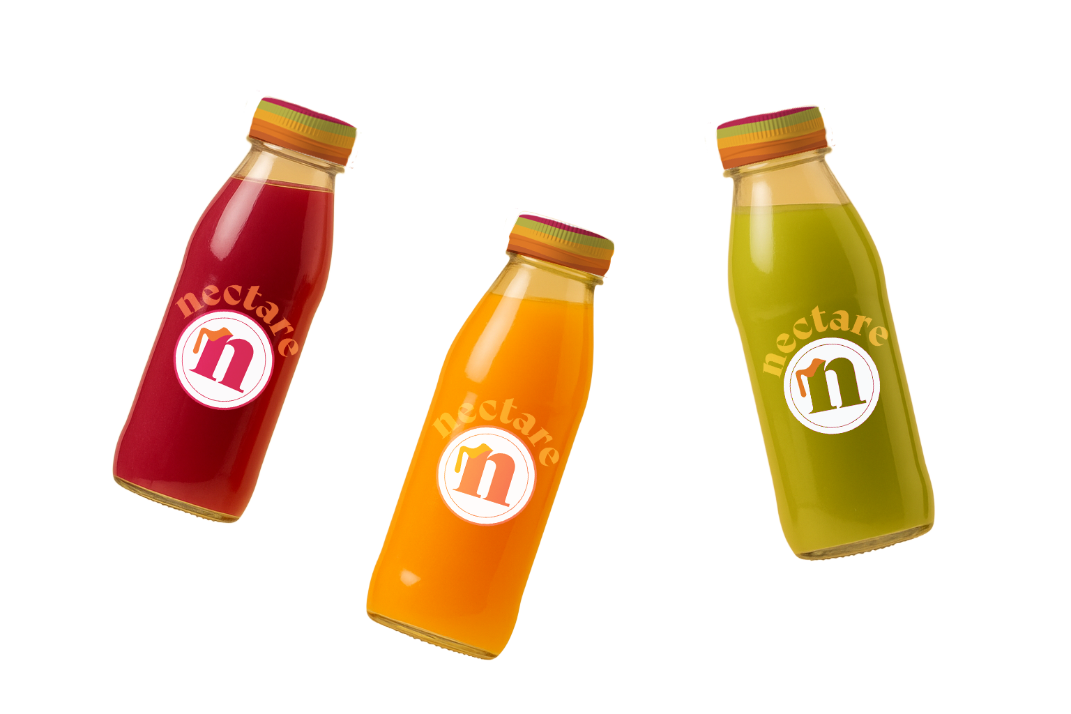
The name Nectare becomes a visual moment through dripping forms that reference fresh juice in motion. This detail adds energy and personality while keeping the system clean and flexible.
The Design Details
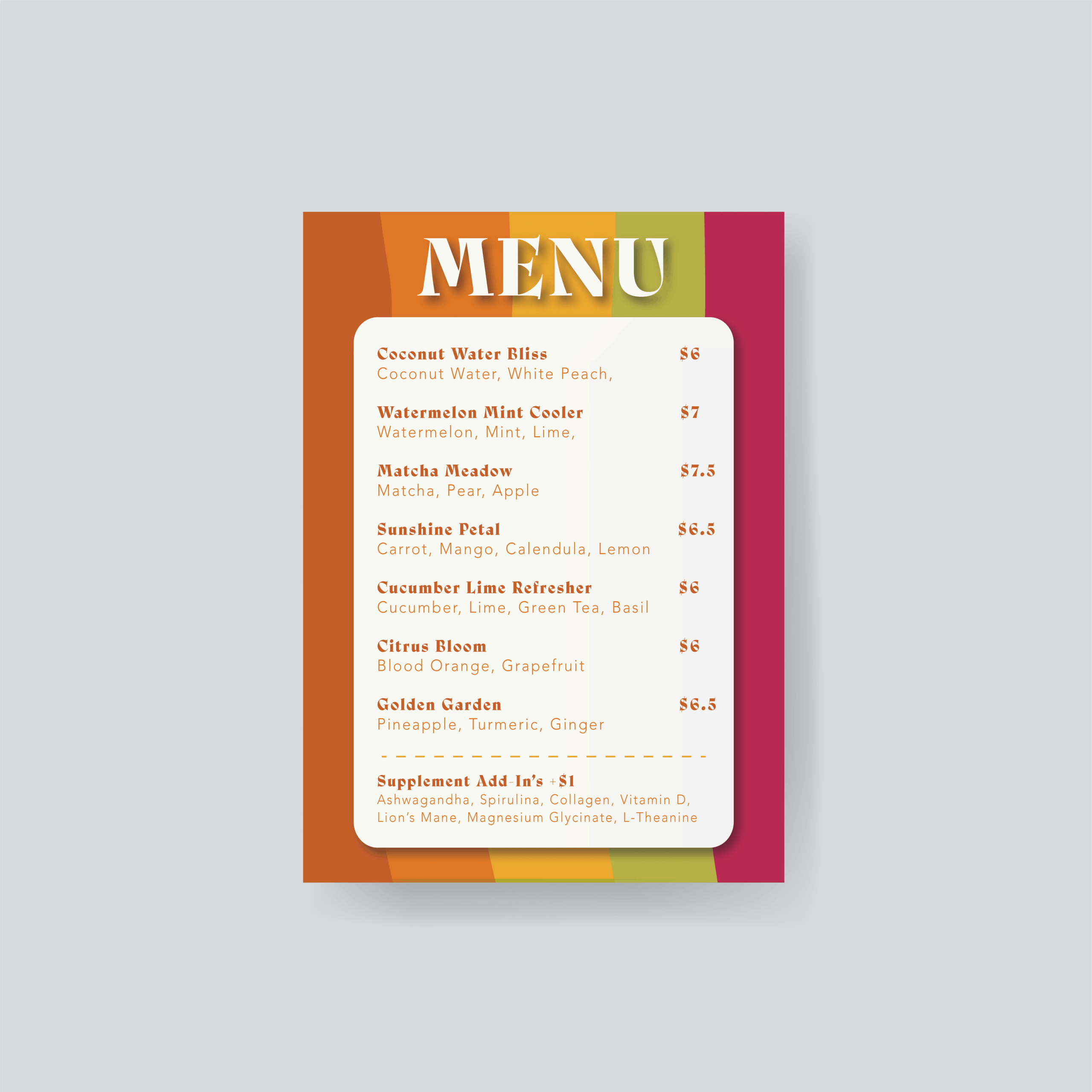
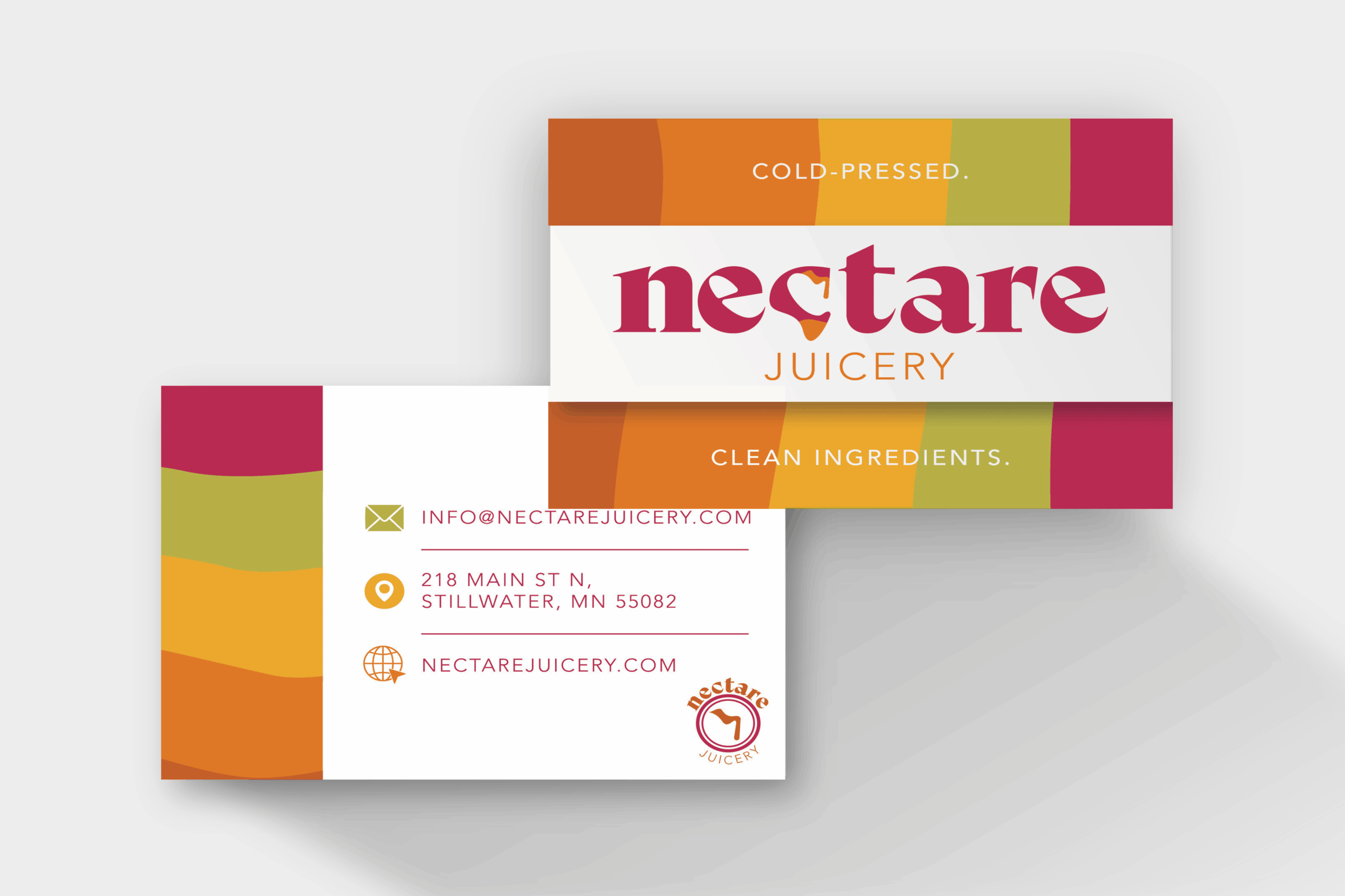
A fruit-forward color palette, rounded shapes, and friendly typography give the brand its warmth. Instead of relying heavily on photography, the system uses bold color blocks and simple layouts that translate easily across bottles, collateral, and digital touchpoints.
The Result
The final identity feels bright, optimistic, and easy to use. It’s flexible enough to scale across new flavors and formats, while still feeling like a distinct brand world rather than a template.
NECTARE JUICERY
Brand Identity · 2025
The Idea
Nectare is a juicery identity built strategy-first, visuals second. The goal was to create a brand that feels fresh, bright, and approachable without falling into generic “healthy lifestyle” territory.
Where It Started
I began with research and positioning — defining who Nectare is for, how it should feel, and where it sits among competitors. From there, the identity was built to feel confident and welcoming rather than minimal to the point of being bland.
Making It Stand Out
The name Nectare becomes a visual moment through dripping forms that reference fresh juice in motion. This detail adds energy and personality while keeping the system clean and flexible.
The Design Details
A fruit-forward color palette, rounded shapes, and friendly typography give the brand its warmth. Instead of relying heavily on photography, the system uses bold color blocks and simple layouts that translate easily across bottles, collateral, and digital touchpoints.
The Result
The final identity feels bright, optimistic, and easy to use. It’s flexible enough to scale across new flavors and formats, while still feeling like a distinct brand world rather than a template.
Selected Works