
GOATEA
Packaging & Brand Identity · 2025
The Idea
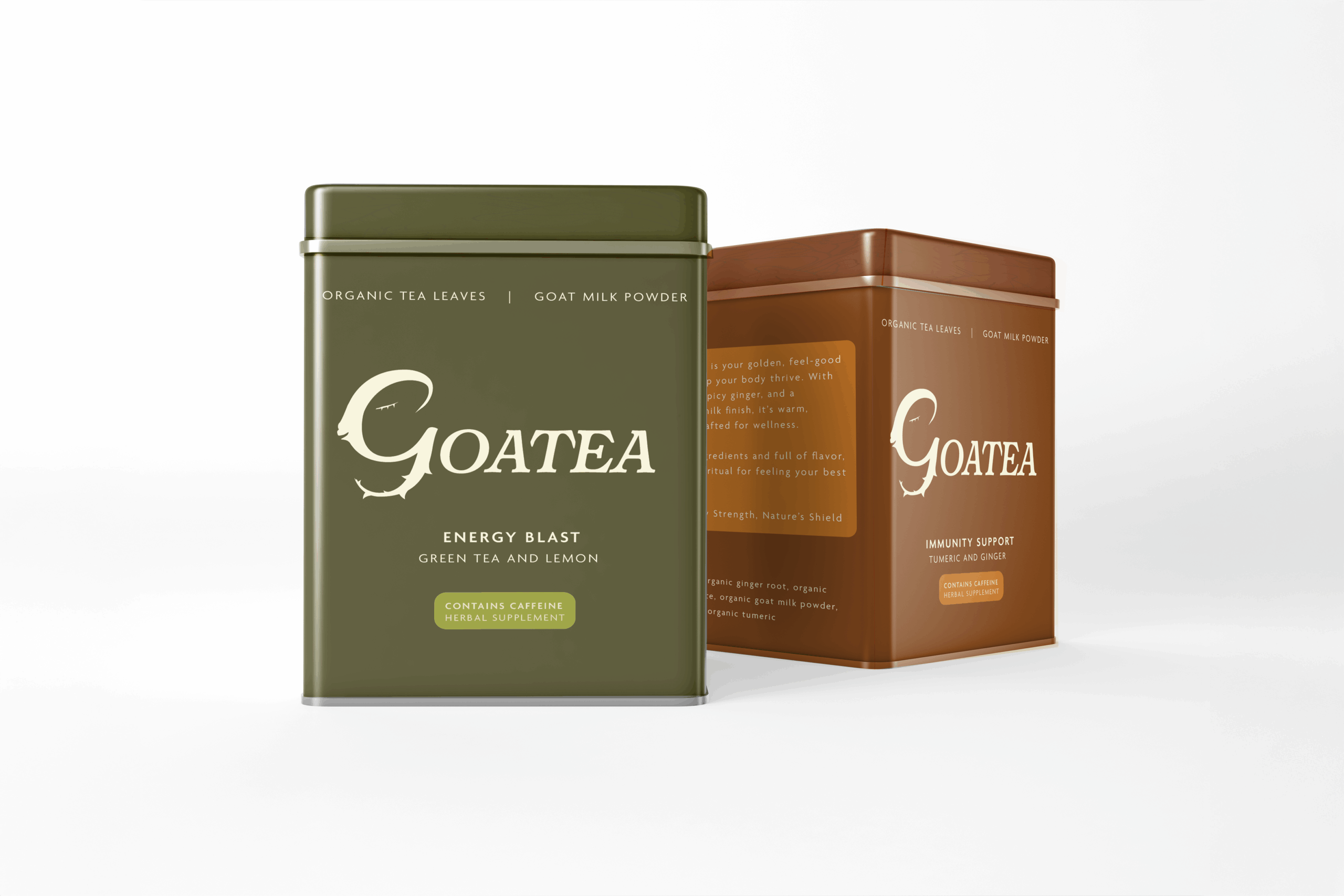
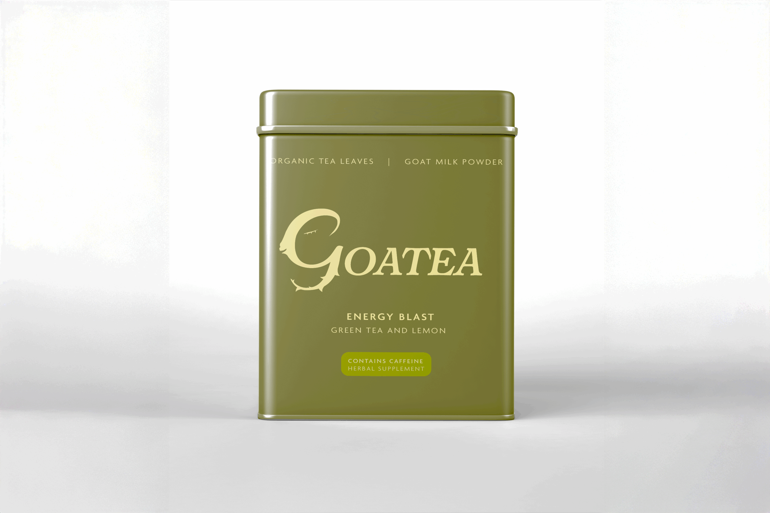
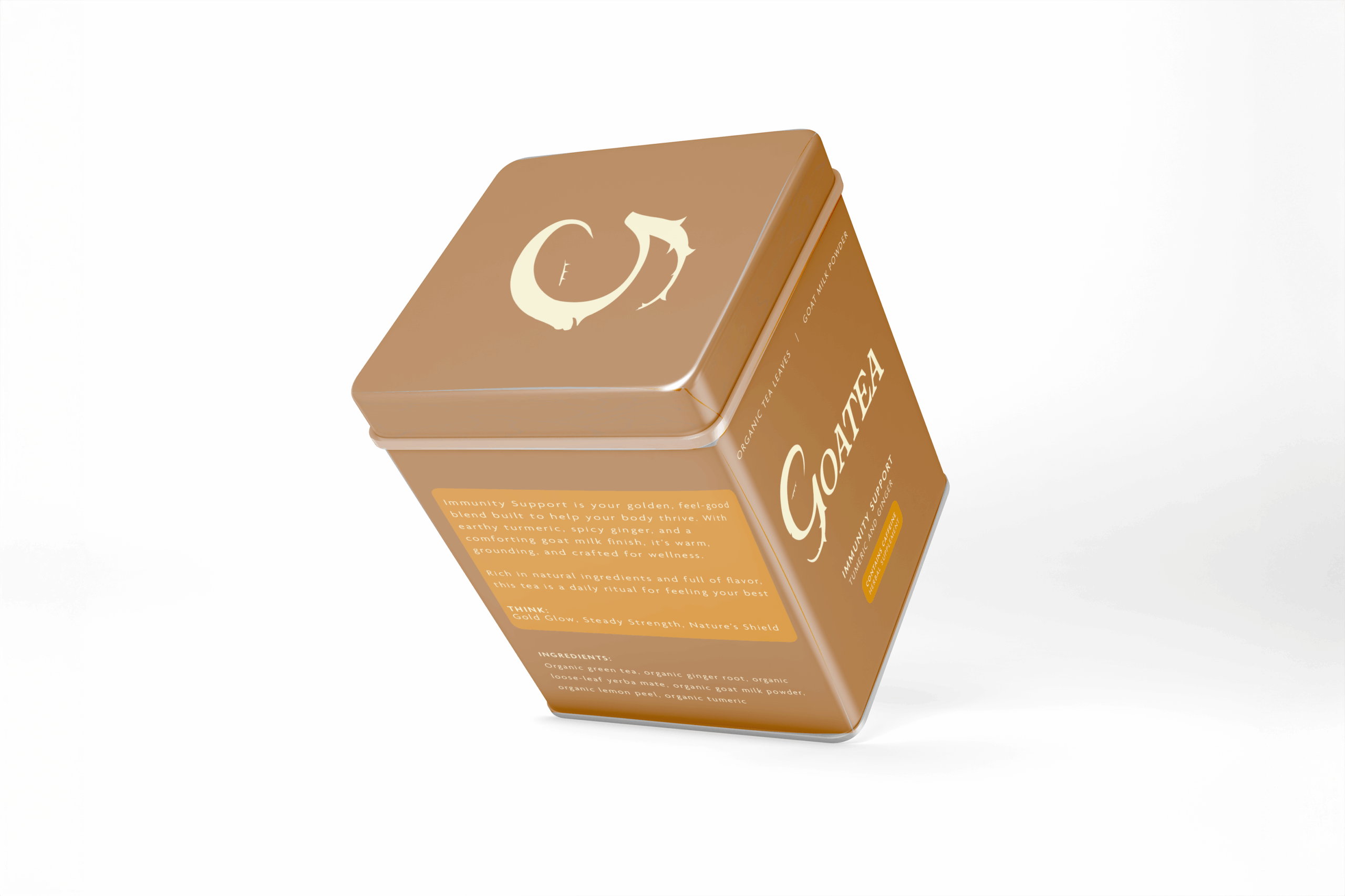
Goatea is an organic goat milk loose-leaf tea brand built around calm rituals and a touch of quiet weirdness. The goal was to create a premium wellness brand that feels grounded and soothing, while still embracing the charm of its goat-based concept.
Where It Started
The idea was to balance comfort and curiosity — something that feels familiar enough to trust, but interesting enough to pause and look twice. I wanted Goatea to feel like part of a slow, intentional routine rather than a loud wellness trend.
Making It Its Own Thing
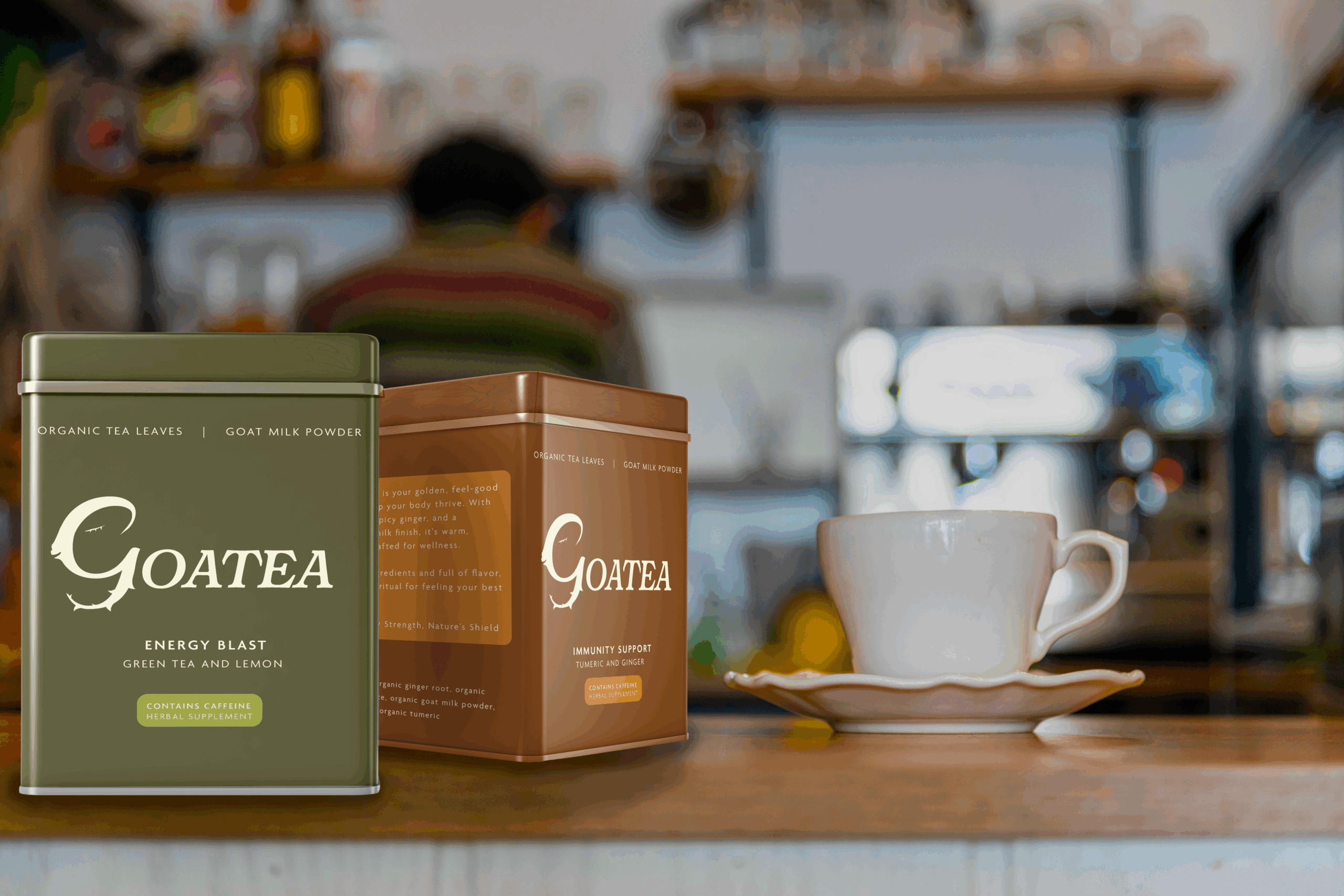
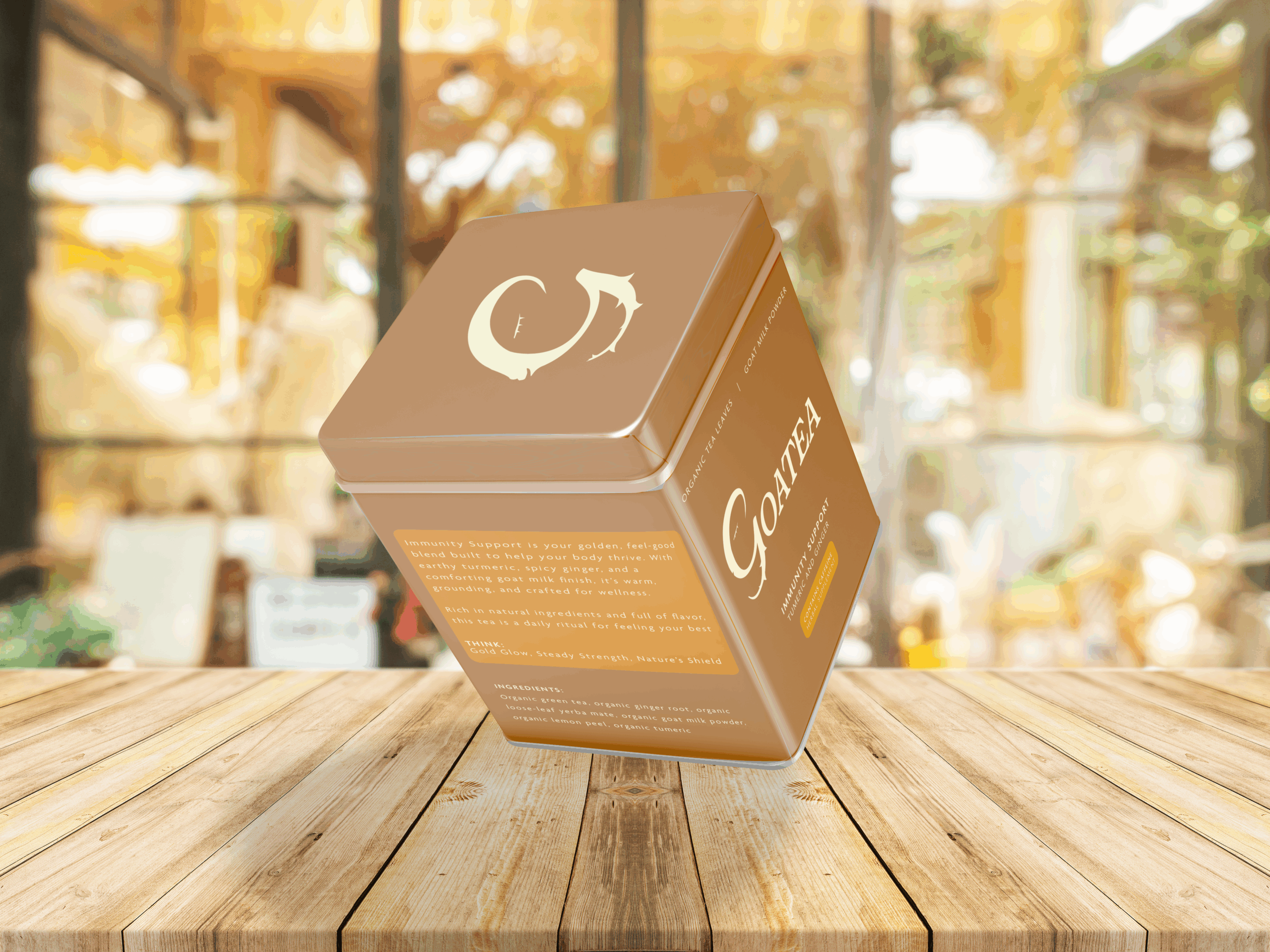
The logo subtly incorporates the goat into the letter G, letting the concept live inside the brand rather than sitting on top of it. This keeps the identity clever and playful without becoming overly literal.
The Design Details
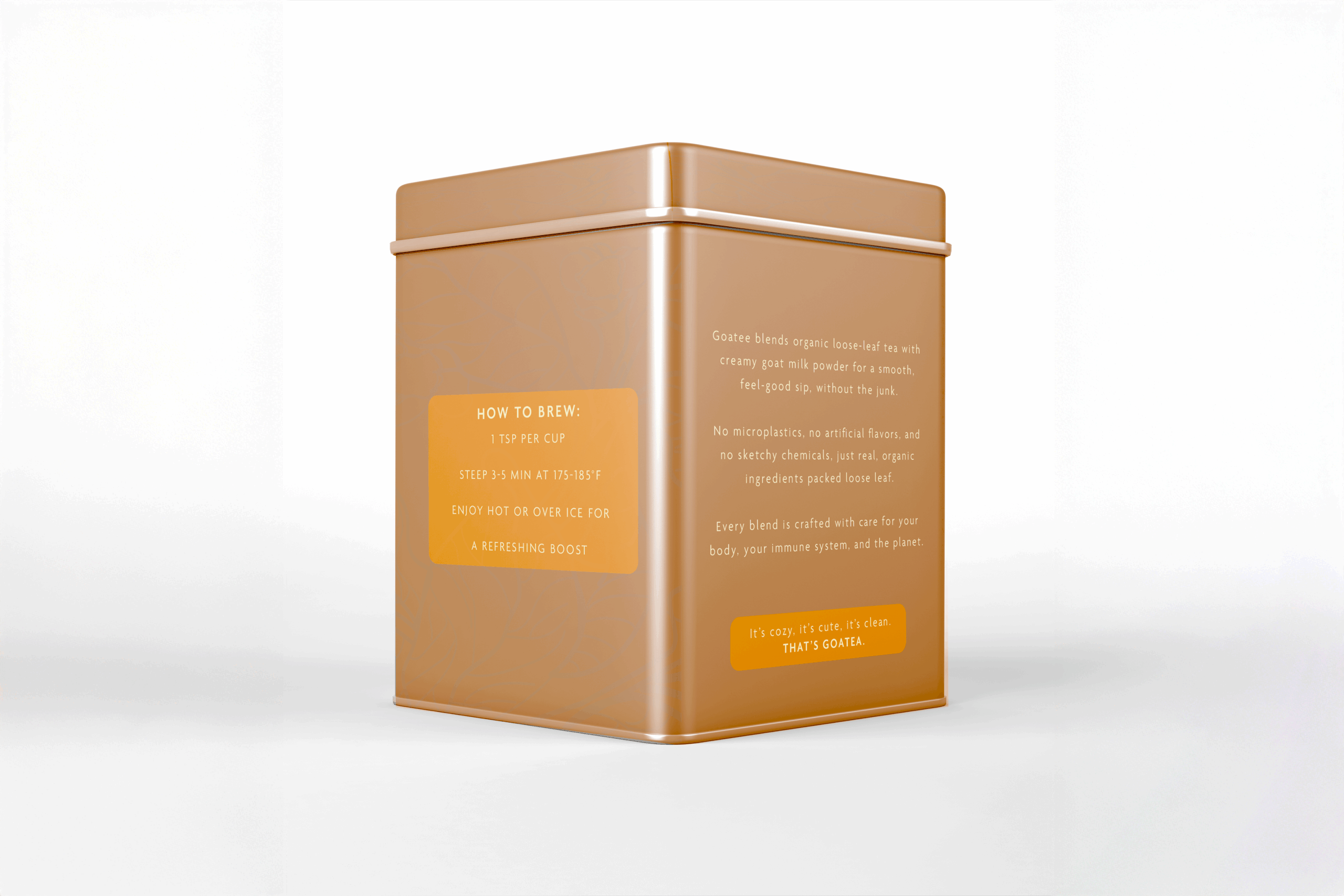
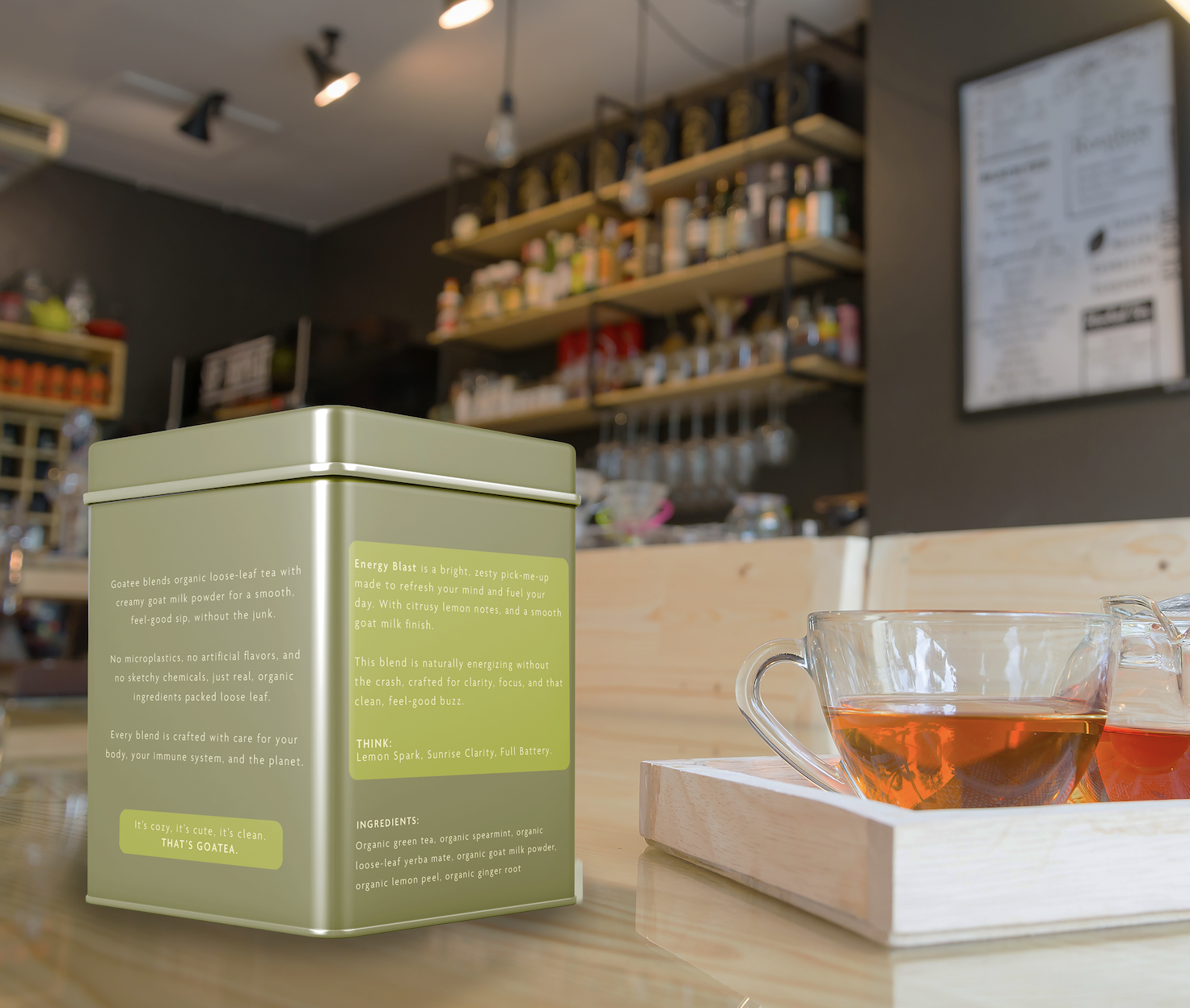
Soft, earthy tones, clean typography, and generous breathing room keep the system feeling calm and considered. Each flavor has its own color and small graphic details, while the layout grid, logo lockup, and information hierarchy stay consistent across all tins. The dielines were built from scratch to ensure the packaging feels intentional from every angle.
The Result
The final system feels collected, calm, and a little unexpected — goat milk tea that looks perfectly at home on a well-curated kitchen shelf. Each tin stands on its own, but together they read as a clear, cohesive product line
GOATEA
Packaging & Brand Identity · 2025
The Idea
Goatea is an organic goat milk loose-leaf tea brand built around calm rituals and a touch of quiet weirdness. The goal was to create a premium wellness brand that feels grounded and soothing, while still embracing the charm of its goat-based concept.
Where It Started
The idea was to balance comfort and curiosity — something that feels familiar enough to trust, but interesting enough to pause and look twice. I wanted Goatea to feel like part of a slow, intentional routine rather than a loud wellness trend.
Making It Its Own Thing
The logo subtly incorporates the goat into the letter G, letting the concept live inside the brand rather than sitting on top of it. This keeps the identity clever and playful without becoming overly literal.
The Design Details
Soft, earthy tones, clean typography, and generous breathing room keep the system feeling calm and considered. Each flavor has its own color and small graphic details, while the layout grid, logo lockup, and information hierarchy stay consistent across all tins. The dielines were built from scratch to ensure the packaging feels intentional from every angle.
The Result
The final system feels collected, calm, and a little unexpected — goat milk tea that looks perfectly at home on a well-curated kitchen shelf. Each tin stands on its own, but together they read as a clear, cohesive product line
Selected Works